
Some time has passed since my last camouflage comparison and to be honest, I was quite surprised by the attention my last fieldtest attracted. The article was a little bit provoking to be honest, but apparently that was what started a very fruitful exchange on various platforms.
One thing let to another and the team of the Polish company Helikon-Tex was kind enough to send me some of their CPU uniforms in various camouflage patterns, to help me with my comparisons. Needless to say I was quite humbled and appreciate this support more than you can imagine!
With that being said I want to start this time with a comparison I was not able to do before for several reasons, like availability and lack of locations. But here we go:
Semi-Arid Camouflage patterns in their respective environments
For this test I used three different camouflage patterns which do not need a lengthy introduction, since they should be well known to the interested and informed public:
- PenCott BADLANDS, the semi-arid pattern by the company Hyde Definition. It was portrayed by me several times, so you should know this one quite good by now.
- CAMOGROM, the commercially available version of the Polish „Suez“ pattern, a derivative of the Multicam family, developed to be compatible with Multicam and its use with NATO partners. It appears to be greener than regular, which is a good thing in my opinion, since actual Multicam was always to bright in my opinion.
- Kryptek HIGHLANDER, the semi-arid pattern by the American Company Kryptek Outdoor Group. [Before I get complaints that I confuse the patterns: it is Highlander and not Nomad. More on that particular issue in a separate article]
So we basically have one pattern which represents all patterns related to the Multicam family, and two other patterns that competed against it in the US Army Camouflage Improvement Effort.
As always… here is a little disclaimer:
I did not edit the pictures in any special way except the following:
- Lens correction
- Water mark
- Blurred my face out now and then
- .jpeg compression to make it web compliant
(The portrait pics at the end of this review series were of course edited to look decent, but that’s about it)
I don’t have the need to bash a particular pattern or lobby one, so you can trust me on my remarks as far as humanly possible. As always, I have no scientific claim whatsoever – I am just trying to give you a decent comparison.
- Also – since I was asked to do so – I will not identify the patterns during the review to influence the reader’s opinion. You can always check the pics and the name of the pattern by clicking on the pic and checking the URL, where you will find the name. Of course I will reveal the patterns at the end, but up until then they will be referred to as “Pattern 1”, “Pattern 2” and “Pattern 3”.
- This time there will be three and a half different scenarios and a total of 33 pics… so bear with me! For the sake of readability I will split the review in two parts. Part 2 will be available this week!
- The pictures were first and foremost taken at 35mm and at times at 50mm focal length. The first to give you an idea of the human eye perception regarding to field of vision and the second to give you a little zoom in the medium distance scenario.
- This time I stuck to two positions: Standing and kneeling.
So without further ado….
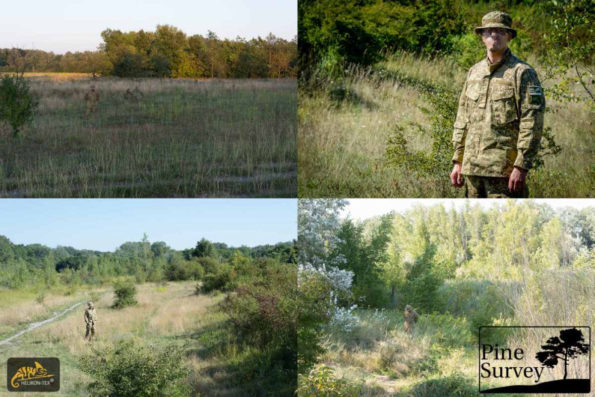
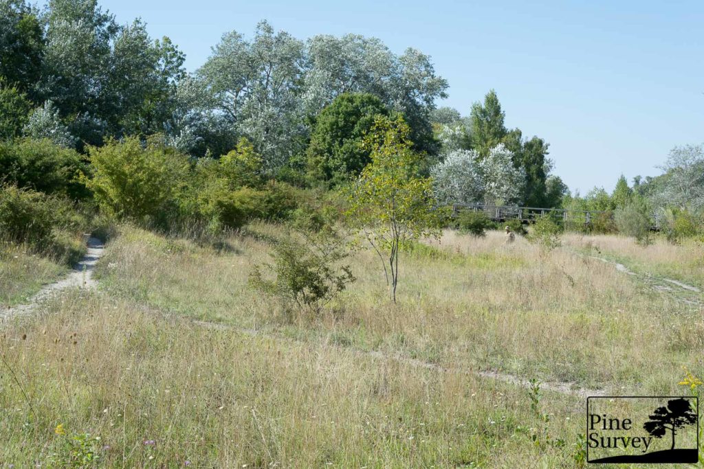
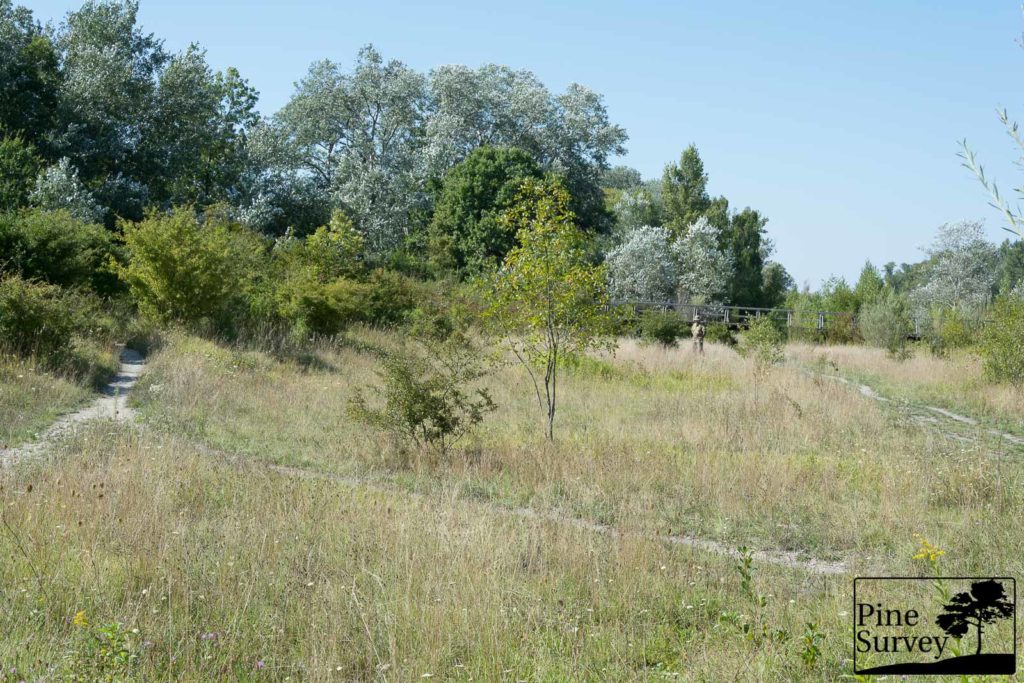
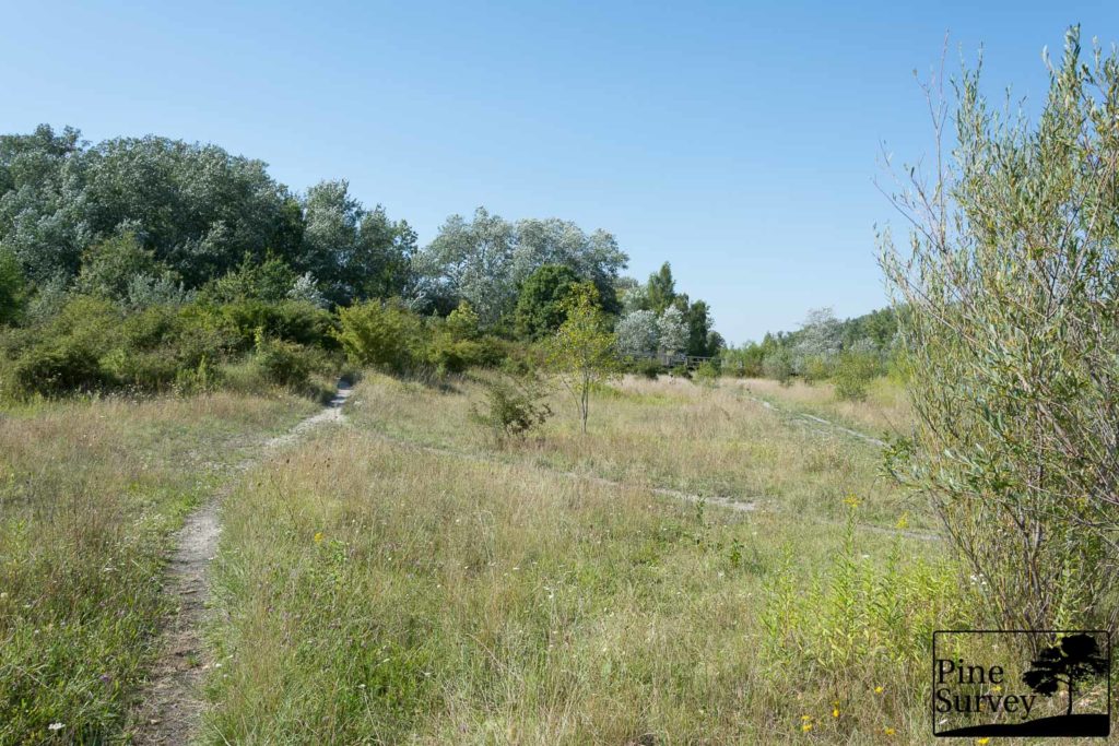
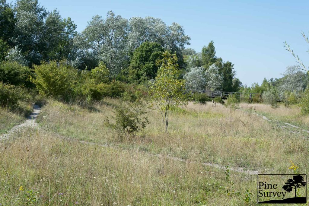
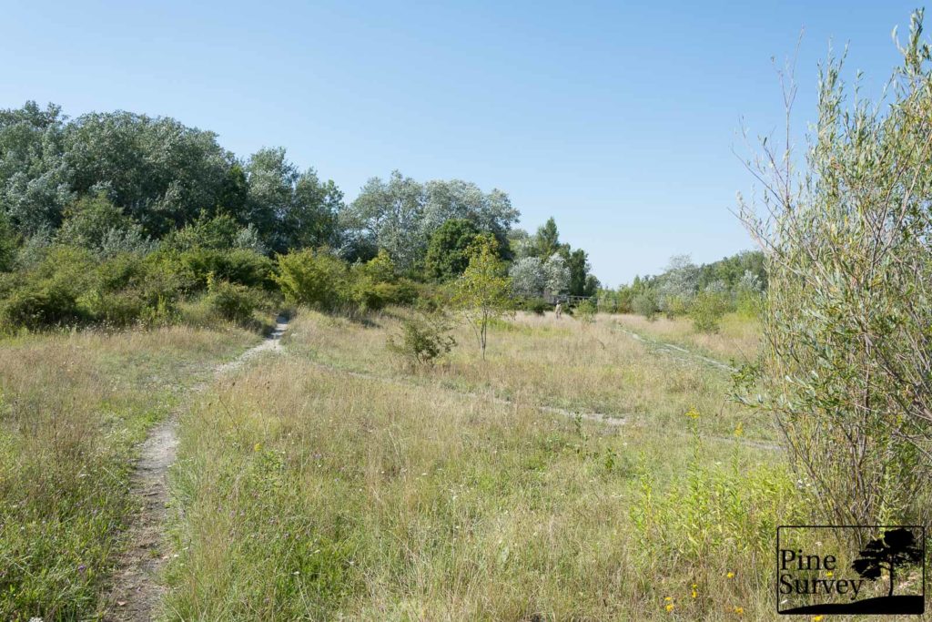
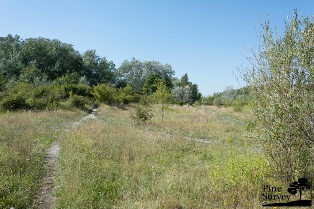
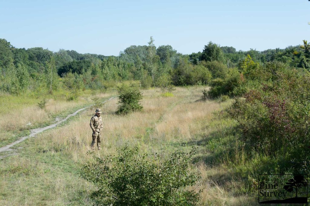
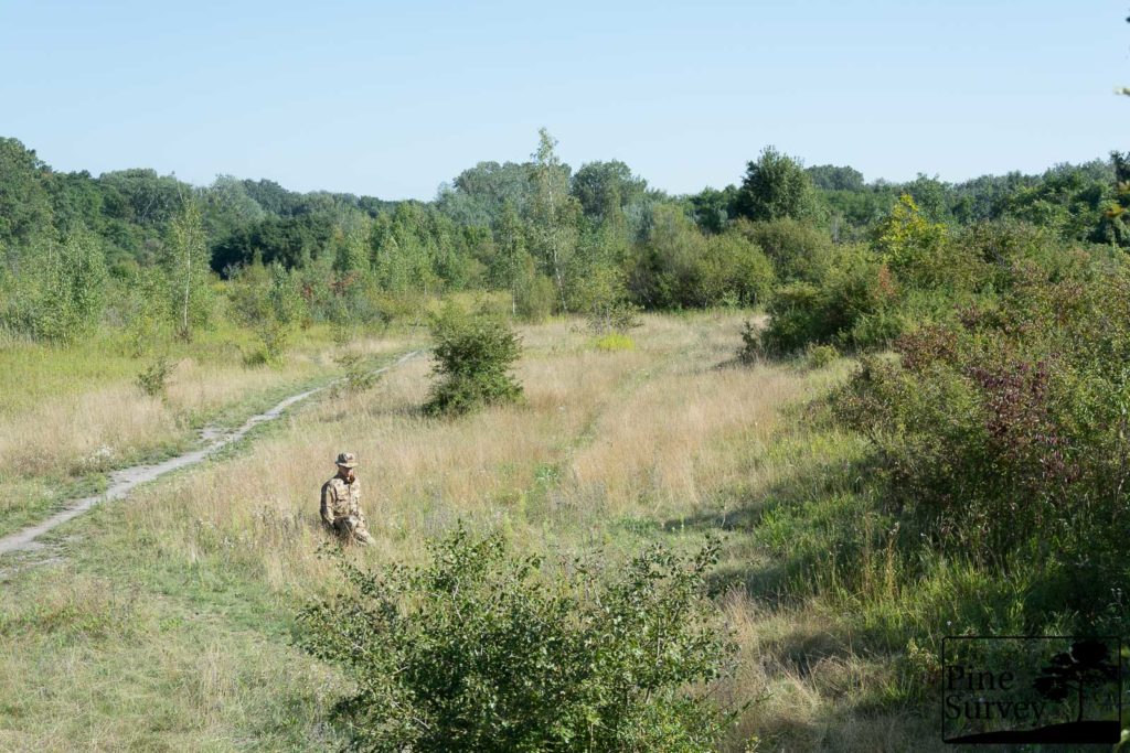
Scenario 1 – Worst Case
The location is an open field, with dry grass and isolated bushes and trees. The sun is nearly at her highest point, so we have fabric shine and very harsh light. The distance is around 50m+. I had problems to not cast any shadows and therefore revealing myself.
I wanted to do this scenario to highlight some arguments done by myself in previous reviews and conversations: a) At a certain distance, the pattern does not matter anymore and only the dominant color is perceivable; b) camouflage uniforms are no ghillie suits or magical caps – you have to follow basic rules moving through the field (please ask your nearest military instructor); c) you will realize why I usually stick to close proximity pictures in my camouflage comparisons; d) you will also realize why it was such a close call at the US Army Camouflage Improvement Effort, even though the end result was of no surprise to anyone following the initiative.
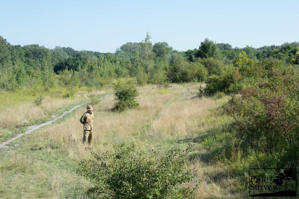
Pattern 1
I can keep my statements short in this section of the review: The dominant color of the pattern is visible. The various elements of the pattern – may they be micro, midi- or macro elements -, are not visible to the human eye without any sort of magnification. Pattern 1 blends into the surroundings because of its dominant color; any structure or shapes are caused by shadows.
Pattern 1 – standing, 35mm
While standing you can identify the silhouette in the open field. Especially with the different color in the background. Looking at the second picture with 50mm focal length it becomes clearer, what I mean.
Pattern 1 – standing, 50mm
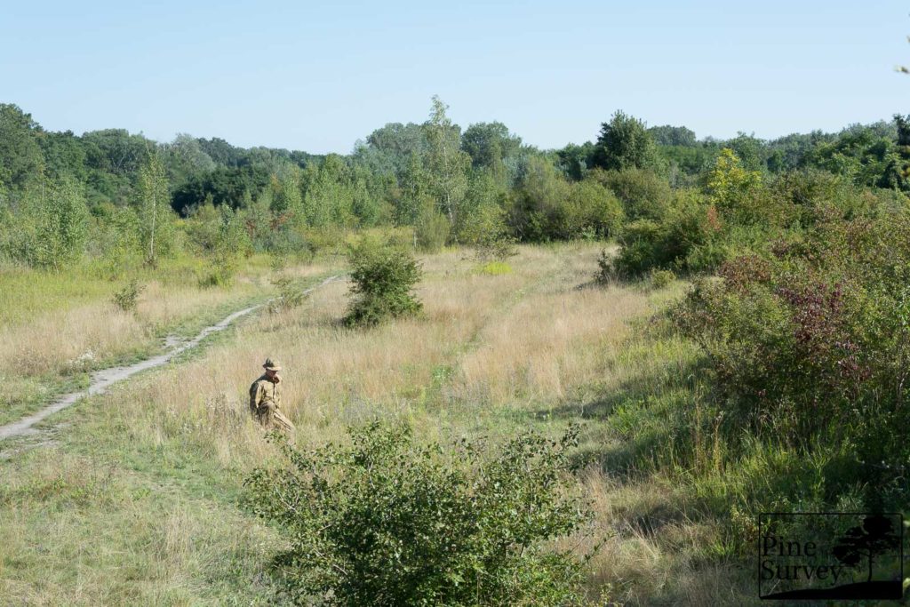
In the kneeling position the figure is blending in with its surroundings, only to be identifiable because of the shadows.
Pattern 1 – kneeling, 35mm
Pattern 1 – kneeling, 50mm
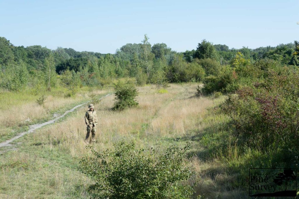
Pattern 2
Same as above, so here I can copy paste my text: The dominant color of the pattern is visible. The various elements of the pattern – may they be micro, midi- or macro elements -, are not visible to the human eye without any sort of magnification. Pattern 2 blends into the surroundings because of its dominant color; any structure or shapes are caused by shadows. It also appears to be a nuance darker than Pattern 1.

Pattern 2 – standing, 35mm
Pattern 2 – standing, 50mm
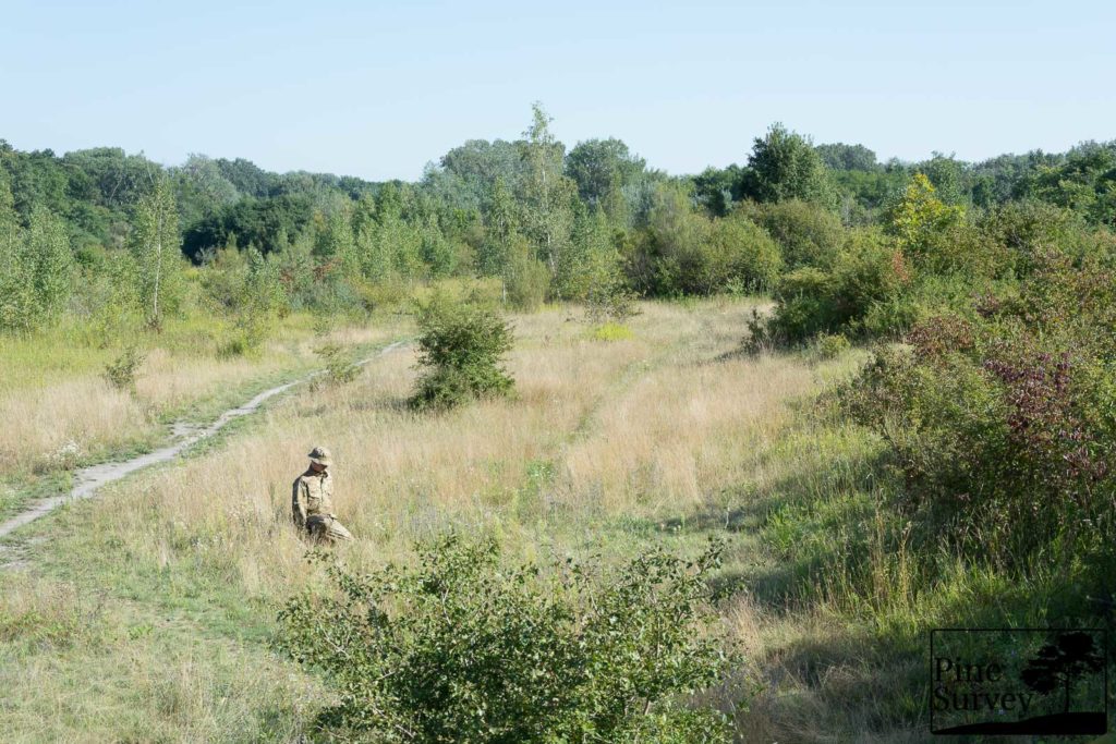
The same observations can be made regarding the standing and kneeling position with Pattern 2.
Pattern 2 – kneeling, 35mm
Pattern 2 – kneeling, 50mm
Pattern 3
Again: The dominant color of the pattern is visible. The various elements of the pattern – may they be micro, midi- or macro elements -, are not visible to the human eye without any sort of magnification. Pattern 3 blends into the surroundings because of its dominant color, any structure or shapes are caused by shadows.
Pattern 3 – standing, 35mm
Pattern 3 – standing, 50mm
What is worth mentioning here is a slight difference: As you can see, I managed to cast less shadows on my left arm/shoulder – from your perspective the right side of the silhouette. Therefore Pattern 3 blends in slightly better at the upper body. At the same time the darker base color makes the legs stand out a little bit.
Other than that, the same observations (as above) can be made while standing and kneeling.
Pattern 3 – kneeling, 35mm
Pattern 3 – kneeling, 50mm
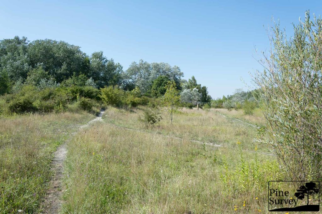
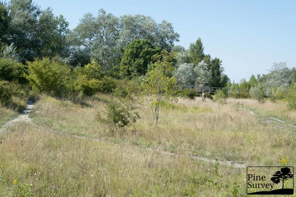
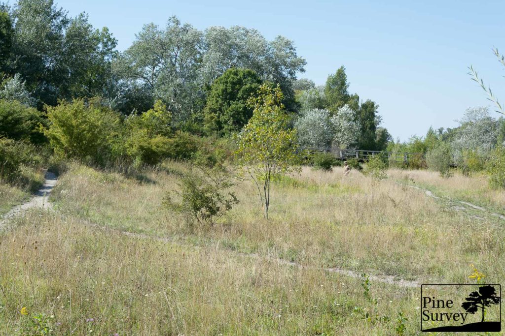
Scenario 1.5 – Worst Case, in close proximity
With this scenario you have basically the same conditions like in the first one, when it comes to light, and surroundings. Additionally you have an elevated position of the camera, mimicking a lookout position. Also the distance is minimized to around 20m.
Because of the close proximity we stuck to 35mm focal length, since no zoom was necessary to get a closer look. At this proximity you will of course see and identify a figure in the open field. The pictures give you a good idea of the various patterns nevertheless.
Pattern 1
The macro elements of Pattern 1 are slightly visible. Other than that, the dominant color of the pattern blends in with the surroundings. Possible micro- and midi elements blend to color nuances hardly visible by the human eye in this direct sunlight. Shadows and posture are the revealing factor here as you can see with the folds of the fabric on my leg.
Pattern 1 – standing, 35mm
The kneeling position improves the situation tremendously.
Pattern 1 – kneeling, 35mm
Pattern 2
The macro and midi elements of Pattern 2 are visible because of the high contrasting color differences. While standing the silhouette is better visible than with Pattern 1 because of the darker color nuances.
Pattern 2 – standing, 35mm
Kneeling is improving the situation and again, shadows and posture are key.
Pattern 2 – kneeling, 35mm
Pattern 3
The macro elements of Pattern 3 are the ones most visible in comparison to the other two. In this situation it is more of a disadvantage though, since the figure is more visible in this particular surroundings.
Pattern 3 – standing, 35mm
Pattern 3 – kneeling, 35mm
Conclusion for the Scenario “Worst Case”
One can’t choose sometimes over which terrain he/she has to move and at which time of the day. This scenario might give you an idea how three different patterns are working in an open semi-arid field with some bushes and trees. As mentioned before, all three have similar properties when confronted with revealing factors like harsh light and open field.
In closer proximity hard contrasts are more of a disadvantage, especially in this particular light conditions. Pattern 2 and Pattern 3 appeared to be standing out a little bit more than Pattern 1 because of their pattern element colors.
To see what makes the actual difference between these three patterns, we have to move to the other two scenarios…
With this first observations Part 1 of this field test ends. Part 2 will show a complete different side of these patterns and ideal situations and environments for the said patterns. Look forward to this other side of the spectrum.
Until then, thank you for your time!
PS.:
- Much thanks to N. for his help finding the locations and helping me with the pictures!
- All uniforms in this review are CPUs by Helikon-Tex
![]()
2 thoughts on “Field Test: Semi-Arid Camouflage patterns: Badlands vs Camogrom vs Highlander”