Please take a second and take a look at this GoFundMe, if you want to support Pine Survey. Thank you!
Introduction – the first signs of PenCott Metropolis
I remember when I met Dom Hyde and Lawrence Holsworth at the Hyde Definition/PenCott booth during IWA 2013 in Nuremberg. Already back then there were talks and pictures of an urban camouflage out there, using the PenCott pattern design. I believe Sabre Defence was even advertising it in their catalogue. And then suddenly all went quiet around it.
Even though there was a computer animation out there being more on the blackish/greyish side, news or updates about the so called “Metropolis” pattern never really materialized into something real. I have to know, since I was probably the most annoying pain in the ass to Dom and Lawrence, constantly inquiring about the pattern.
PenCott Metropolis materializes
So it was a nice surprise when during IWA 2017 all of a sudden several companies were displaying apparel in PenCott Metropolis. The response from the visitors of the exhibition was more than positive, my blog post showed quite the interest, but then it went quiet again.
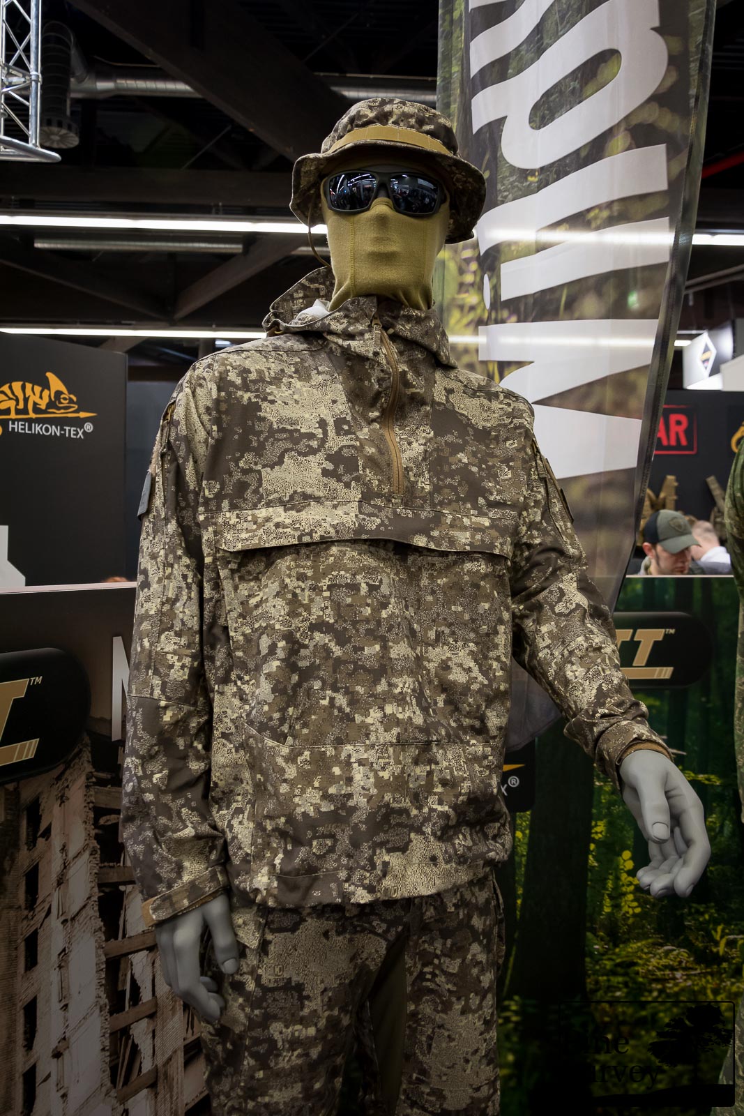
PenCott Metropolis at IWA 2017
After all those years, and several versions to get the colour right, input from professionals etc. the pattern was finally available. But the timing could have been better, considering most of the people dealing, selling and buying gear were somehow convinced that the “camo bubble” had burst with the end of the US Army Camouflage Improvement Effort and an overly saturated market.
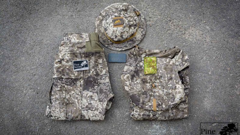
In that sense I would say: Better late than never. Because on a personal level I am of the opinion that this is the most fascinating of the PenCott patterns so far. After lots of convincing, writing, and being very annoying (again), I finally managed to get a set of PenCott Metropolis from Helikon-Tex and put it to the test in the urban landscape, where it belongs.
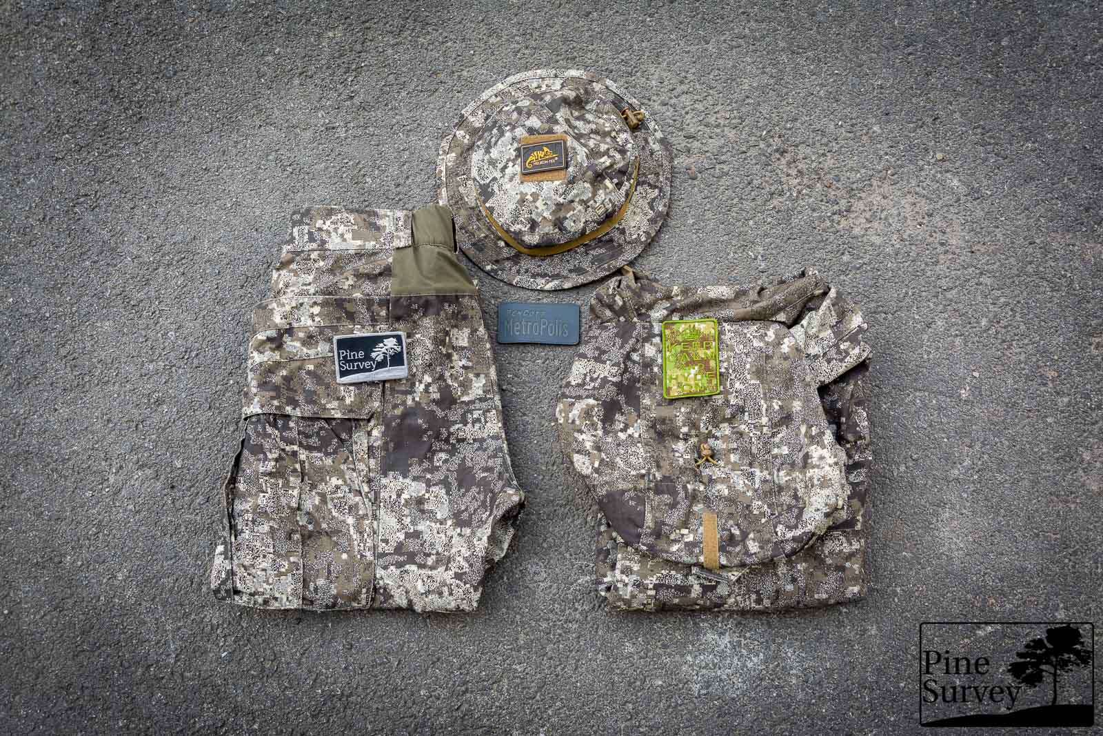
PenCott Metropolis – prototypes by Helikon-Tex
This was not easy, considering our turbulent days of national security concerns, legal reasons of private properties and photography permits etc. Luckily I was allowed to shoot at some interesting locations and therefore am able to give you some more insights into PenCott Metropolis. To not keep you waiting too long, I decided to make at least two parts of my review, because it takes time to find locations in the city and get things done undisturbed.
Therefore this first review will be a short introduction to my views on urban camouflage, things to consider and then the first round of locations. At the end I will also give you some colour comparison pictures with some gear (quick and dirty), plus some snapshots.
But first things first:
When it comes to urban camouflage I want to start with some personal thoughts and observations. Having in mind that the urban landscape is completely different than the countryside, woods, wetlands or whatever environment you might think of, we have to understand several things:
- In the city you are either completely in the open, or you have plenty of structures which offer either concealment or cover, most of the time even both. In that particular case you do not need camouflage at all, since you have a physical object behind which you can hide or take cover.
- If you are in the open, you have to deal with quickly changing environments. This is not the type of “I am going from the desert dunes into the oasis” kind of problem. This is the “I am going from a white painted wall, to a brick wall, change to a concrete background and suddenly have glass window behind me” scenario.
As a result, urban patterns are the most difficult to design, since they not only need to blend in, using a certain color palette, but also need to disrupt and confuse vision, to reduce the time for the user to be identified.
There are plenty of “urban” camouflage patterns out there, specifically designed for Law Enforcement and the Military. Some are mainly grey, some are extremely black dominant. For a very long time it seems the consensus was that it has to be this way.
They also differ in their purpose. So while for example ATACS-AU is designed to blend (a bit too well since it turns into a greyish color at 10m distance), ATACS-LE was designed to purely look aggressive. The same can be said about Multicam Black which is literally described with the purpose to “project(s) a distinctly authoritative presence appropriate for domestic operations.”
So beside the difficulties of the urban landscape (fast changing environment: colors, structures, day/night) you also have to differentiate between different purposes (camouflage vs intimidation).
Even more caveats:
Before I start I want to point out the following – as always! I did not edit the pictures in any special way, except the following:
- Lens correction
- Watermark
- Blurred my face out if necessary, or any logos, personal or institutional infos you might find in an urban setting for privacy reasons.
- .jpeg compression to make it web compliant
A short explanation to the environment and the procedure.
I tried to find various different urban settings to give a wide arrange of impressions. The pictures portray two different positions:
- Standing in the open (to get an idea of the pattern in this particular surrounding and if the colors match it)
- Kneeling, to narrow the silhouette and improve the effect.
I decided to stick with a focal length of 35mm (this is close to the human eye perception). Therefore I ended up with 2 pictures of each location each. The maximum distance was always 15-20m. So we are talking close proximity! Also: This is basic camouflage, no Ghillie suit, no other enhancements and no mythological or Sci-Fi based device like Siegfried’s cap in the Nibelungen Saga, or a Predator cloaking device.
But enough with the details. Let’s get down to business:
PenCott Metropolis
The pattern family should be well know to many of my readers by now. The geometry of the pattern is the same with all of the others from the PenCott family. For Metropolis the colours were chosen to blend with built-up, urban environments, under various light conditions, while at the same time the fractal-based design disrupts the vision.
The colours are chosen to be on a brighter level to make the pattern better usable in low-light conditions (lighter colors appear darker, while too dark patterns stand out as black objects at night). From an academic standpoint, research of NATO and the US-Military was incorporated into the design. Additional to that the input from military and police personnel with experience in urban settings was taken into account.
Location 1 – Bridge over channel – Graffiti
The first setting is underneath a bridge. The pillars are tagged with a variety of graffitis using different colors. At the same time the surroundings are dominated by concrete, steel and tarmac.
Standing
While standing in front of the pillar, PenCott Metropolis breaks up the silhouette with its geometry and depth, while at the same time blending in with the browns and greys of the surroundings.
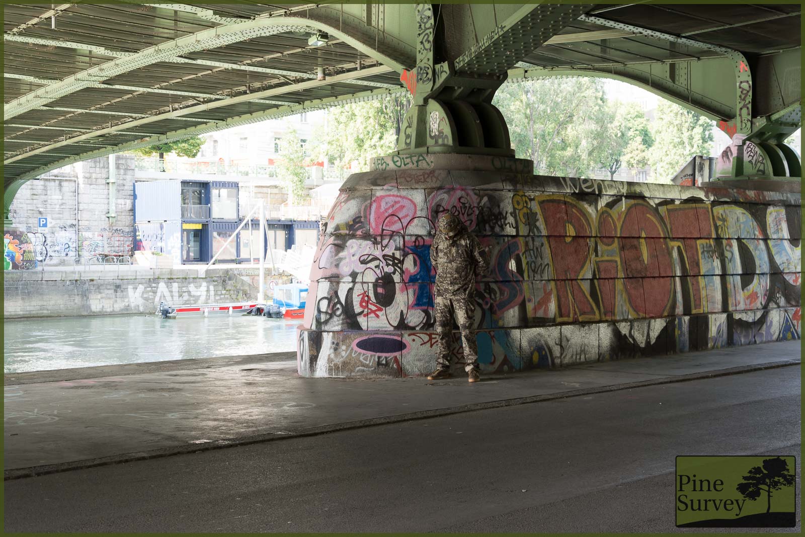
PenCott Metropolis – Standing, 35mm focal length, distance ca. 20m
The colours of the graffiti do not affect the camouflage in this particular scene. Interestingly enough you could get the impression there is a figure sprayed on the pillar itself.
Kneeling
While kneeling the whole effect maximizes. The disruptive combination of colours and the fractal design break up the shape of the silhouette and makes you look twice.
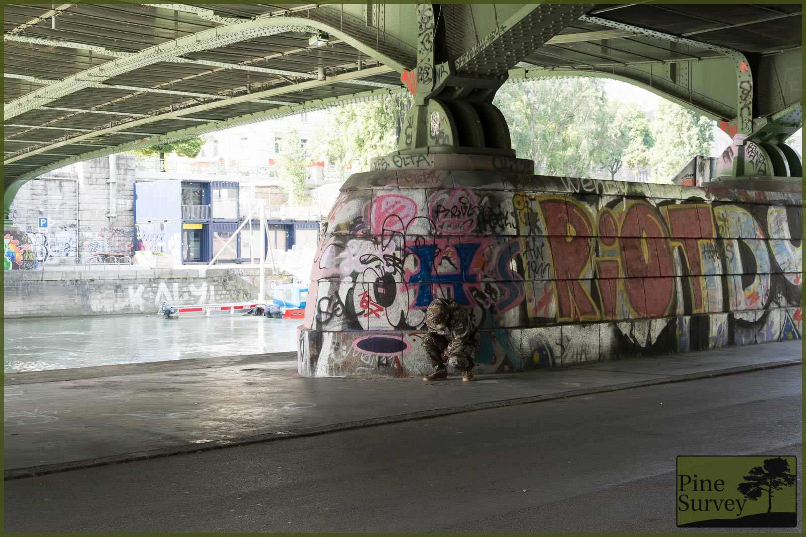
PenCott Metropolis – kneeling, 35mm focal length, distance ca. 20m
Location 2 – entrance area, staircase
The second setting is even more in the open. During daylight and very diverse color settings. On the one hand white walls, concrete floor and polished stone.
Standing
While standing PenCott Metropolis blends in with the colors of the staircase. There is no doubt the silhouette would make it stand out, but these are areas professionals know to avoid, when possible.
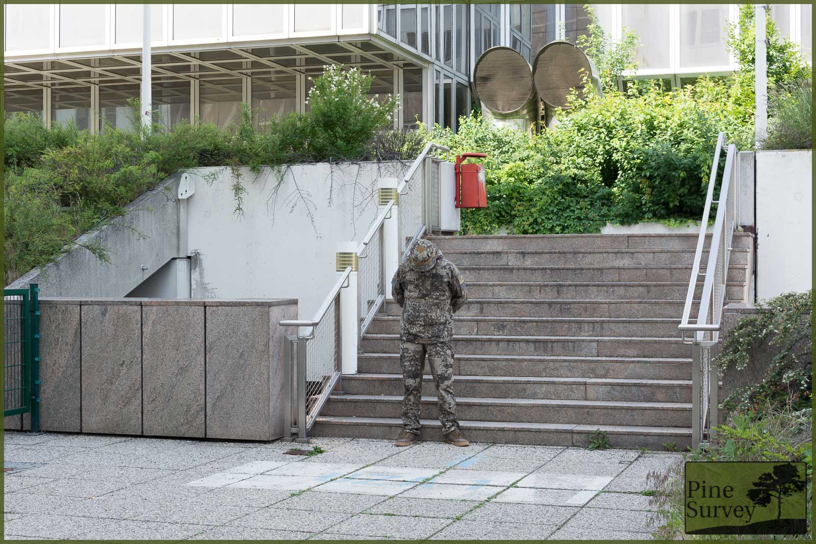
PenCott Metropolis – Standing, 35mm focal length, distance ca. 10m
Kneeling
While kneeling the human shape gets broken up by the pattern. Even though you know something is there, it takes you some time to identify what. Again, the choice of colors and the geometry of the pattern blend and disrupt effectively.
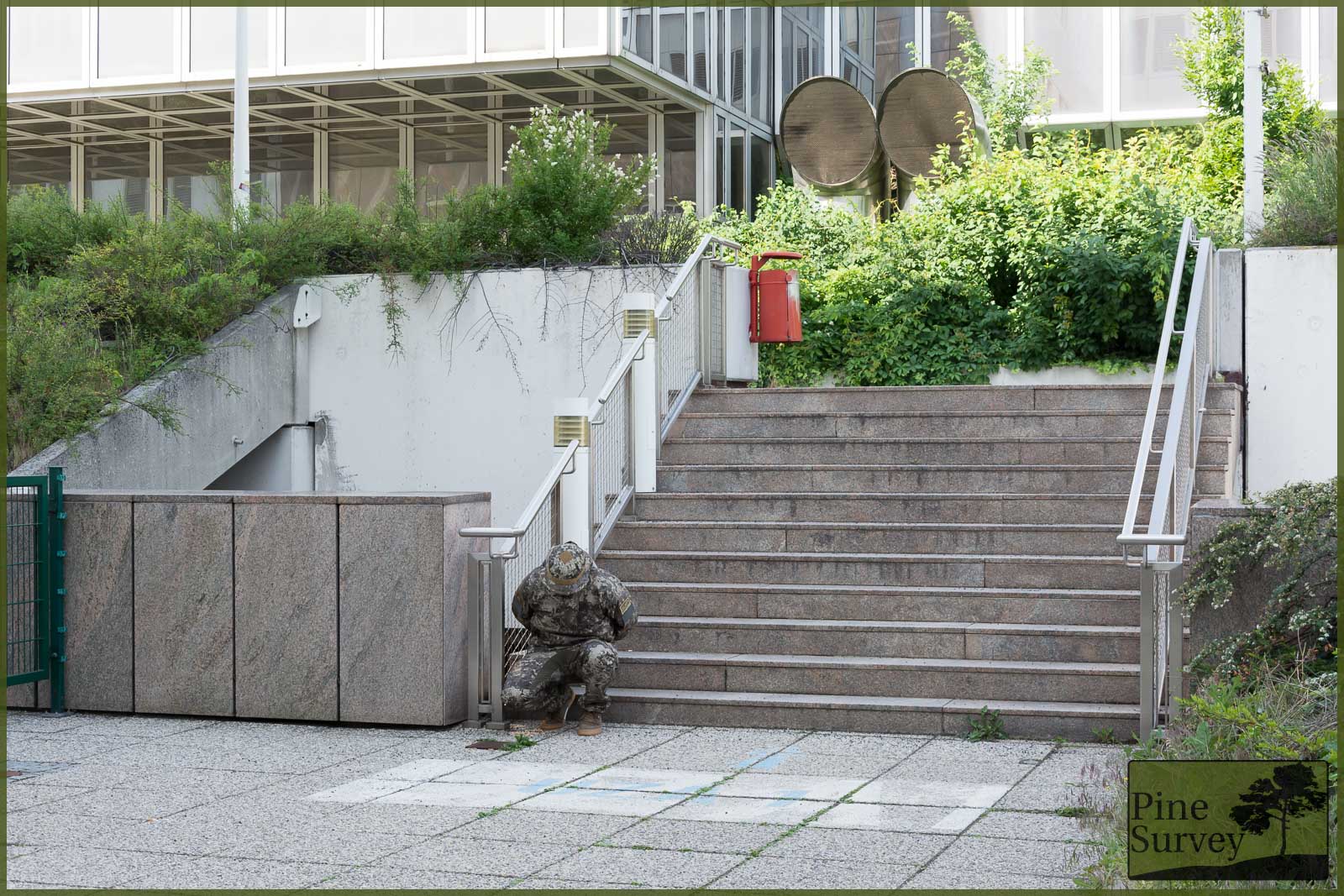
PenCott Metropolis – kneeling, 35mm focal length, distance ca. 10m
Location 3 – brick wall alongside a road
This is a scenery you will often find in older cities. Brick walls next to modern materials like tarmac or concrete.
Standing
While not completely blending in with the colors of the bricks, the greys and browns of PenCott Metropolis mimic an urban, inanimate feeling. The macro elements of the pattern break up the Silhouette, while the midi and micro elements create an organic look. Even though the colors are not perfect in this case, the geometry does the trick to break up and blend.
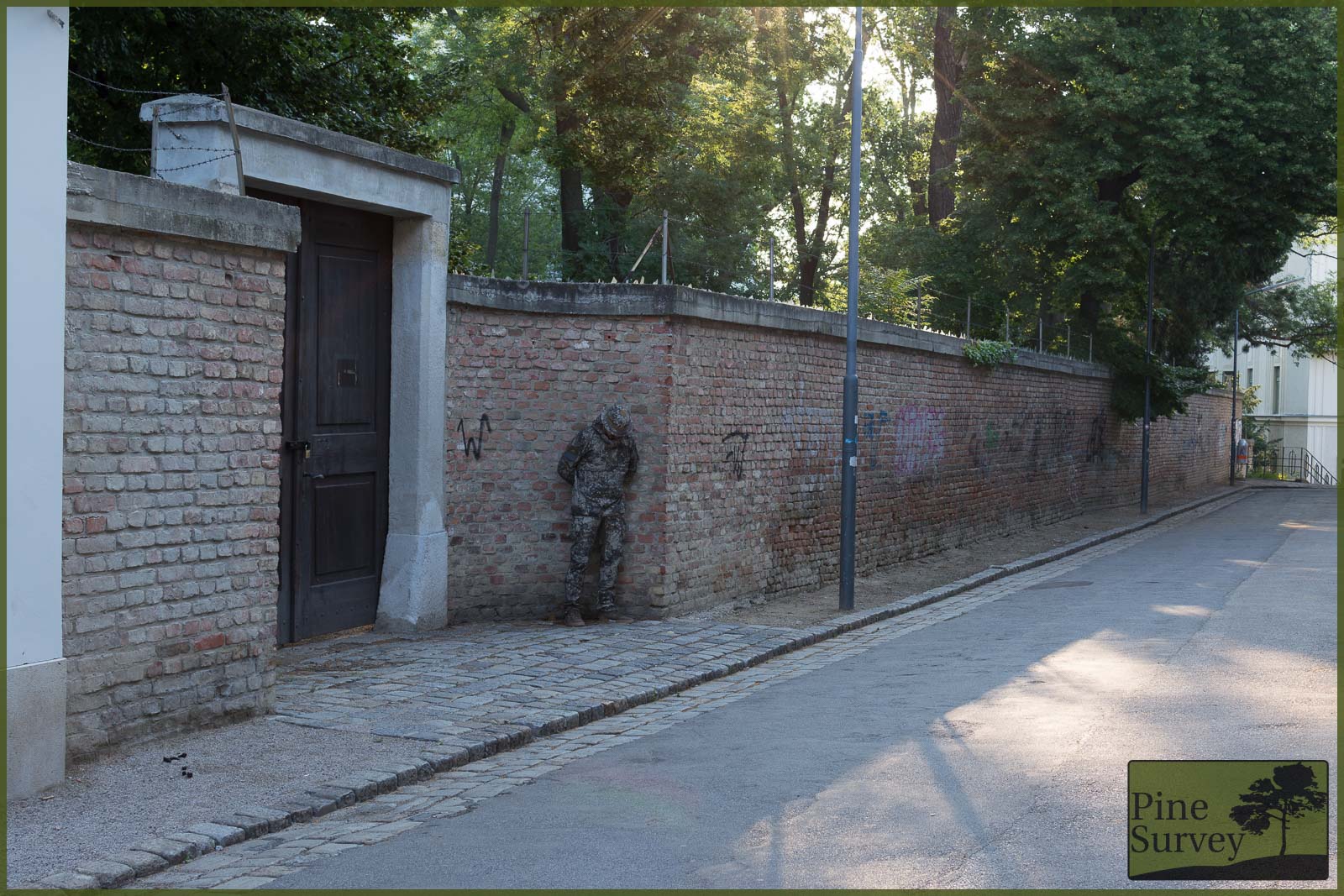
PenCott Metropolis – Standing, 35mm focal length, distance ca. 20m
Kneeling
This becomes more apparent while kneeling. Now you would get the impression of a large water stain, or even mold. To be honest I wish I would have taken a picture from 30+ metres away since I am sure the silhouette would have completely vanished.
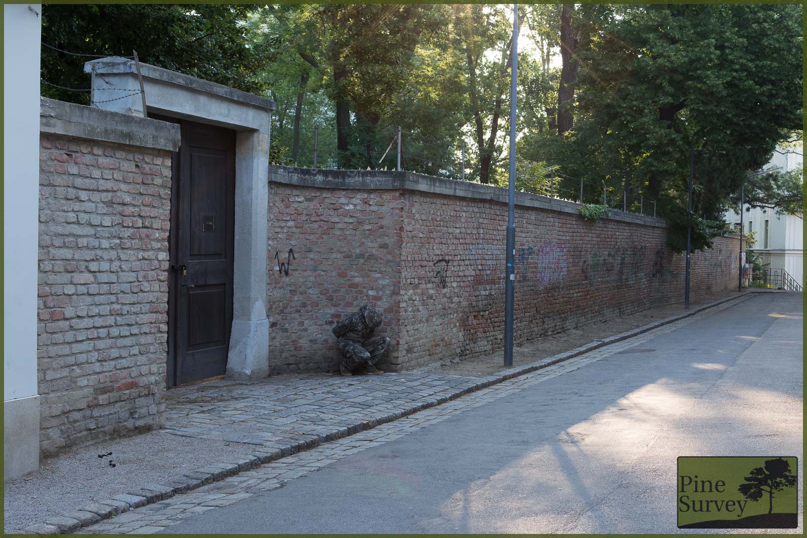
PenCott Metropolis – kneeling, 35mm focal length, distance ca. 20m
Location 4 – staircase II
This is another setting with various different elements. Again some tarmac, concrete, but also some basic vegetation. The backdrop consists of granite cobblestones.
Standing
The surrounding colors consist of various grey tones as well as brown to red elements. The organic look of the macro elements disrupts the human silhouette, while the color palette blends the pattern into the surroundings.
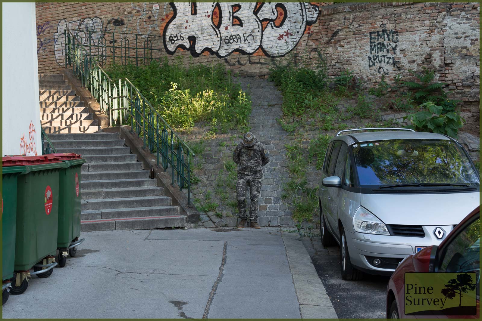
PenCott Metropolis – Standing, 35mm focal length, distance ca. 15m
Kneeling
In the kneeling position the effect maximizes as expected: More disruption since the silhouette is minimized, while still profiting from the macro, midi and micro elements which result in various shades and create more depth to deceive the vision.
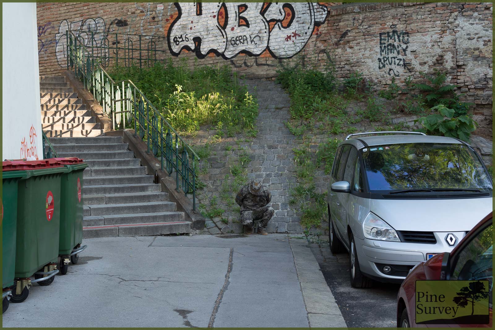
PenCott Metropolis – kneeling, 35mm focal length, distance ca. 15m
Additional pictures – solid color compatibility, cellphone snapshots
I want to add several other pictures. Firstly some close ups with possible gear combinations made from solid color fabric. This is an aspect worth considering, since not everyone has the money to spend on full matching gear, especially when several camouflage patterns are being deployed. I know there will be someone complaining about the empty vest and the lacking plates in the carrier, but the point is colour combination this time!
Combat Vest
First the combination with Karrimor SF’s Predator Combat Vest in Coyote.
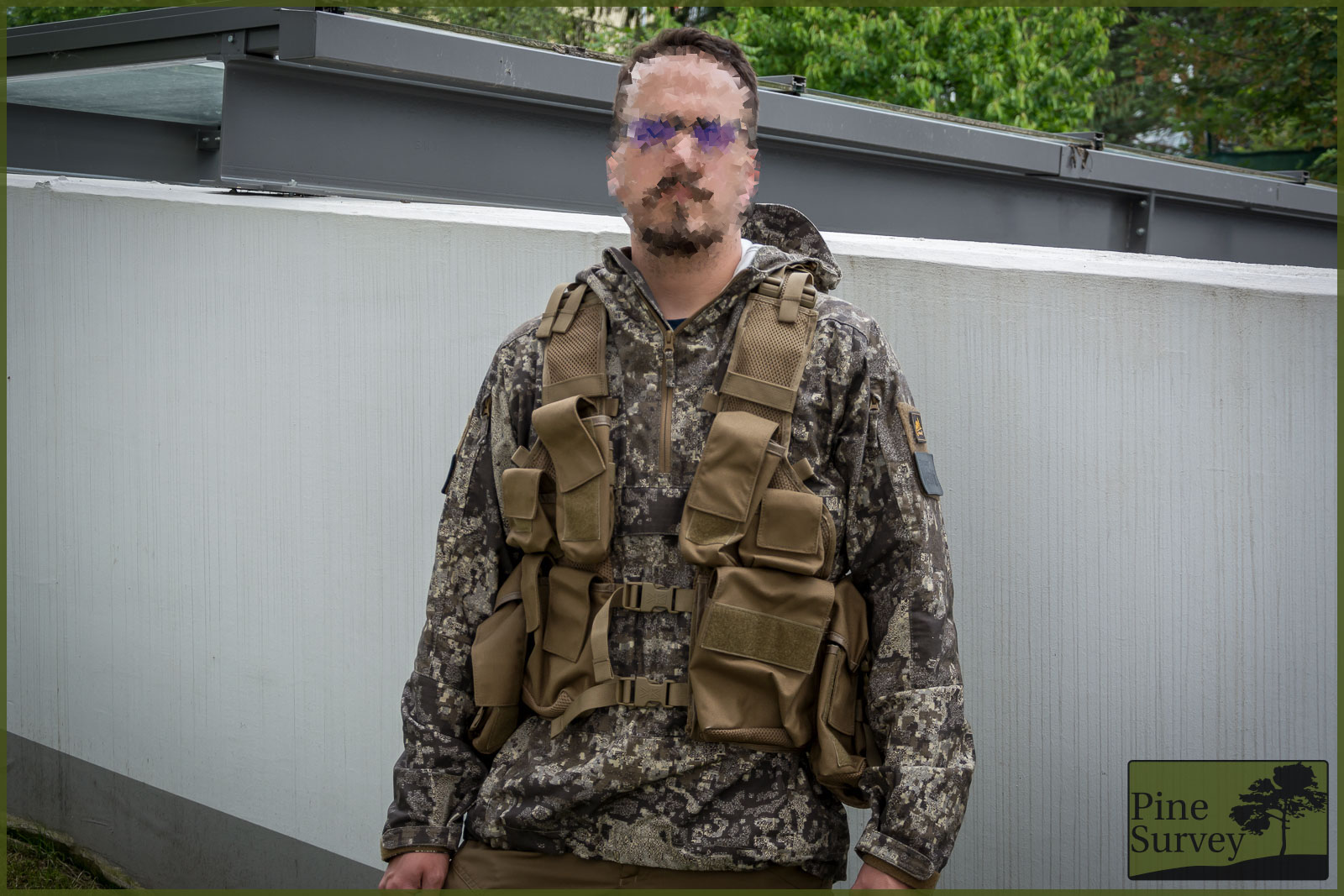
PenCott Metropolis in combination with Karrimor SF Predator Comabt Vest (Coyote)
Plate Carrier
Second a Plate Carrier by Tasmanian Tiger in their dark OD, which is basically Ranger Green.
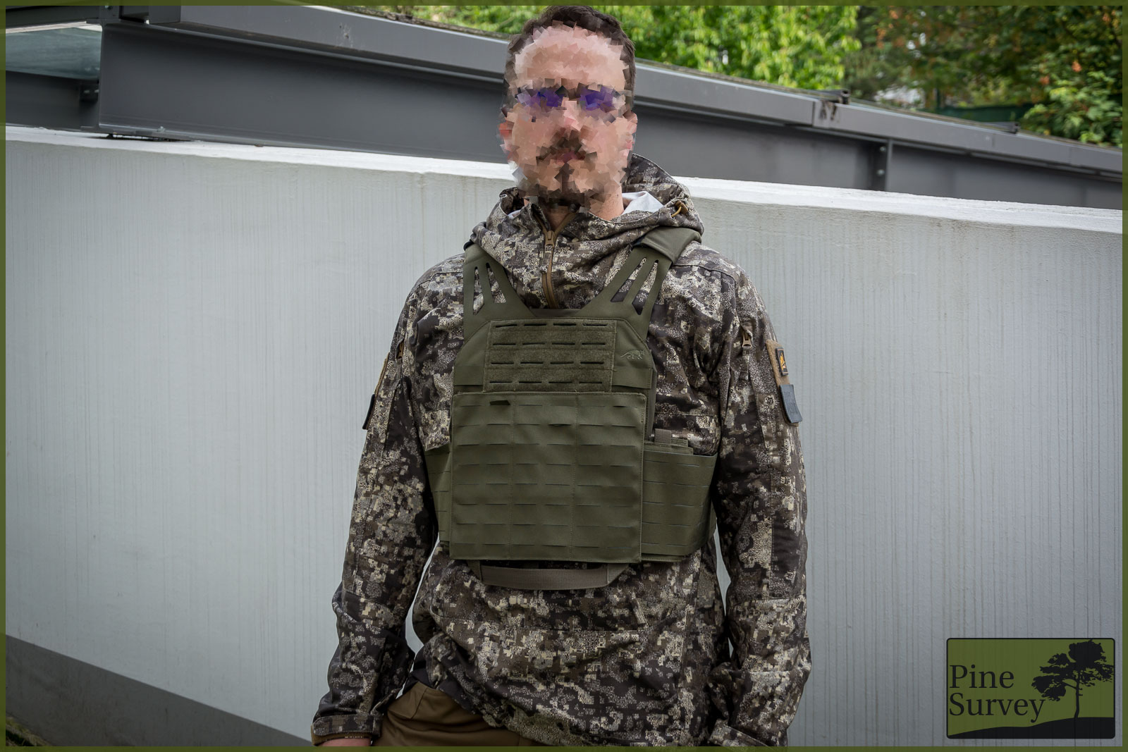
PenCott Metropolis with Tasmanian Tiger LC Platecarrier (Ranger Geeen)
Snapshots
Some additional snapshots:
First a more casual picture in a place where I could not make more pictures because of the crowd. It shows the organic macro, midi and micro elements quite nicely blending in with the stones of a church.
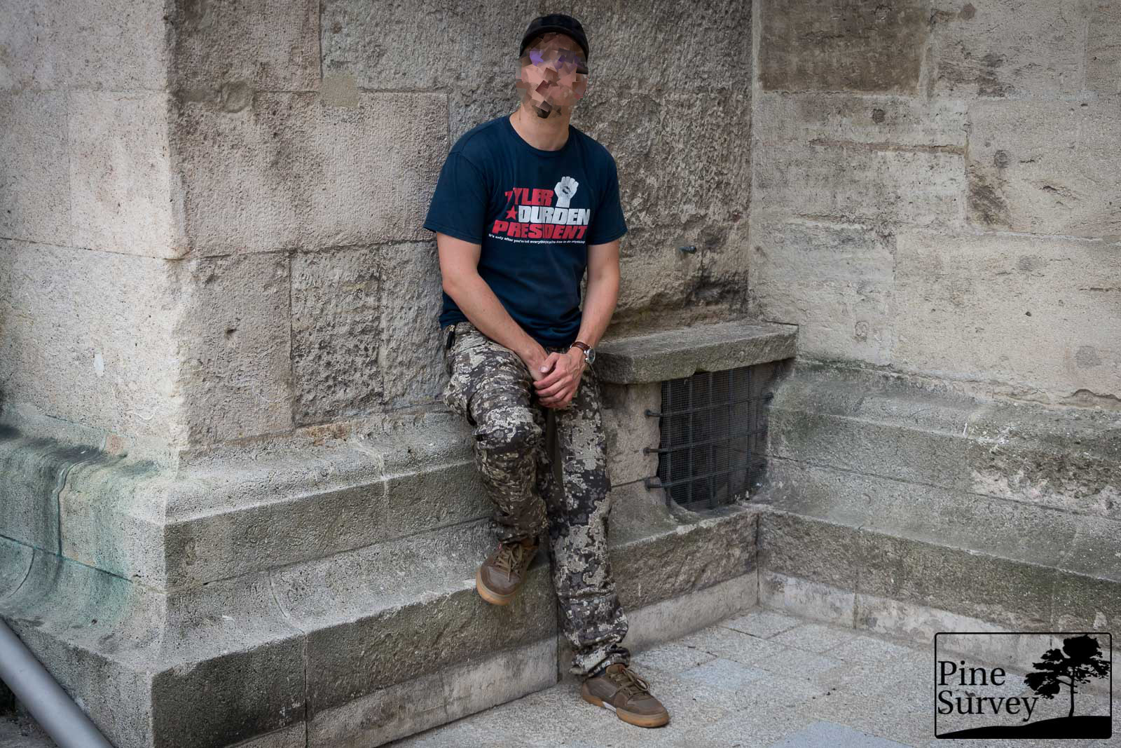
Casual combination to literally blend in with the crowd.
Secondly a spot-on mixture I took with more luck than actual intent: A stone bench here in the city was the perfect sibling of the Metropolis pattern.
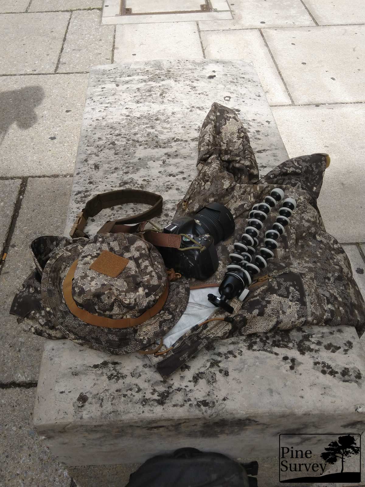
Cell phone snapshot with the gear on a surprisingly matching bench
Thirdly a leg selfie in the subway. Would have loved to take pictures down there, but it just was not possible.
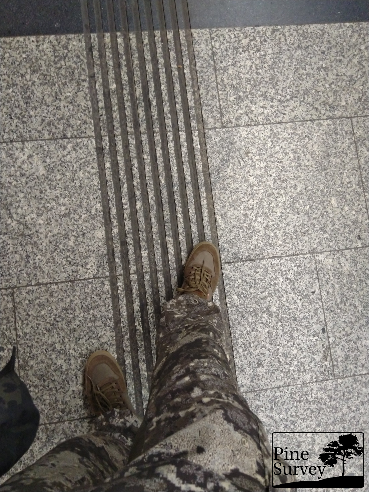
Subway floor – couldn’t take pictures there
Conclusion
In this myriad of urban camouflage patterns PenCott Metropolis is an interesting and effective option to consider. As already mentioned, I regard it as the most interesting and versatile of the whole PenCott family.
As a result Metropolis works because it uses three aspects of camouflage: Depth, Blending and disruption. This is done by the PenCott pattern’s macro, midi, and micro elements as well as the specific choice of colors which result in a very organic look.
Considering todays security issues and conflict zones, urban camouflage patterns will play a more important role in the future. Effectiveness and compatibility with existing equipment are always aspects which are considered by state bodies. As you can see from the pictures, PenCott Metropolis delivers on both.
Time will tell if companies will pick up on the need for urban camouflage – the question is if they will do it before or after state authorities will go for it.
With that being said I will finish part one of this review. Part two will follow as soon as I have more material to show. I am still looking for a construction site where I am allowed to shoot, as well as a parking garage, but also some more natural things like a gravel pit.
With that being said I want to say thank you for reading and many thanks to Helikon-Tex for providing me with the Metropolis set!
For infos re availability contact Hyde Definition, Helikon-Tex or your company of choice!
Take care.

One Response Comment