
Introduction
PenCott Wildwood… I have to admit, I did not care much about this particular PenCott variation for the simple reason that I always considered it obsolete. When it was introduced in 2017, I already had 5y of the best experience with Greenzone, making my interest in any other temperate pattern minimal. At the same time, PenCott Metropolis was of much more interest for me, since it was a long time in the making and also covering a niché in the market, which is only filled by a few camouflage patterns.
However, since 2017 PenCott Wildwood gathered quite the followers, mostly because it is a Helikon-Tex/Direct Action exclusive and these two brands have a loyal fan base. But several things did not add up for me – the difference to PenCott Greenzone was minimal and the consistency in the print of the materials caused several rants on the internet by disgruntled customers.
Reason enough for me to chime in and take a closer look at it. Matej of Perunika was immediately on board and kind enough to provide a MBDU set of Helikon-Tex for me to do this test. After all, he was as curious as me, since we had lengthy discussions on the pattern.
PenCott Wildwood vs. Greenzone
But enough of the intro, let’s get into more detail.
PenCott Wildwood
The story behind PenCott Wildwood is interesting enough to mention it here – especially since there are several theories and rumours out there being discussed in FB groups etc.
When presented during IWA 2017, the press statement described Wildwood as “[..] developed at the request of Polish Special Forces, through a deep collaboration between Hyde Definition and Helikon-Tex. It is optimized for the moderate climate woodland areas of Central and Eastern Europe and was created by adjusting the tonal values of GreenZone by adding more brown shades, and de-saturating the bright green.”
And indeed, the first prints on lightweight Nylon and Versastretch (softshell) material were indeed 50% brown/tan color tones, making the pattern look more subtle and more tan and light brown, than Greenzone. With the introduction of NyCo and Cordura prints this changed, resulting in a green dominant pattern and erasing most of the tan/brown – especially in the NyCo print.
After talking with several industry insiders, some people involved and discussing it on Camouflage Addicts in a dedicated thread, one can narrow down the explanation models and rumours as follows:
Starting with some context: Around the time of development, the Polish Army was (and partly still is) in a Future Soldier Project called Tytan, aiming to equip the land forces with new equipment (including new camouflage). Adding to this, and separate from the land forces initiative, a one+ year trial done by Special Forces snipers, looked into available camouflage patterns and named Multicam Tropic the winner of their trial.
The development of PenCott Wildwood
The development of PenCott Wildwood itself started within a Direct Action project, when Polish Special Forces began to look into the gear of said company. Parallel to that, SF tried to find a single camouflage pattern to use on Polish homeland territory, to put an end to the variety of patterns used (Multicam, A-TACS etc.).
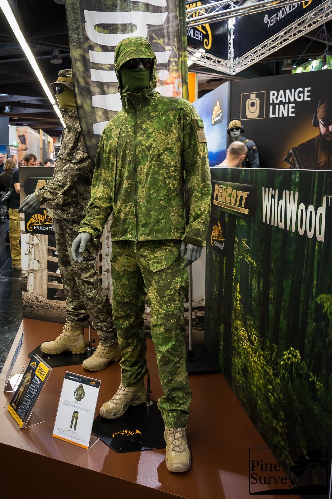
PenCott Wildwood during IWA 2017
What is confirmed: an unofficial request was made to find a new pattern – preferable Polish. This initial design presented by PenCott consisted of 50% light tan and brown and was printed that way on the lightweight Nylon and Versastretch material. The first products using this were also presented during IWA 2017. Unfortunately nothing came out of this SF project.
With the newly introduced NyCo and Cordura prints the story becomes a bit fuzzier and moves into the realm of rumours. There are two narratives currently circulating:
- One being that it has been changed by Helikon-Tex/Direct Action to a green dominant color variation with the look and feel of MC Tropic. Most likely (but not confirmed) to have another shot at the project with SF, after MC Tropic was named the winner of their trials.
- The second explanation model is a series of problems during the printing process itself. Supposedly it came to a last minute disagreement with the initial printing partner and then to another delay caused by a government contract, which had priority over the commercial print.
Since nothing came out of the unofficial request by Polish SF, PenCott Wildwood turned into a purely commercial pattern, featuring two variations of Wildwood. A more tan/brown dominant on the lightweight Nylon and Versastretch and the green dominant on NyCo. The Cordura is a story of its own, since I have seen only finished products, which do not show wider areas of the pattern – it seems to be as brown dominant as the Nylon prints, but with the same greens as the NyCo.
It is hard to say what the real reasons behind the color shifts are. When looking at MC Tropic, some of the rumours do not seem too far fetched. A certain similarity in overall look and feel can’t be negated. At the same time saying that the colors are a full match would be an overstatement either. So until there is an official statement, this matter will stay unresolved.
While not an exact match, Wildwood is darker just like MC Tropic and features the same light tan and some greens
With that out of the way, let’s take a closer look at the field test.
Methodic Remarks
The usual caveats, I want to point out beforehand: First of all, I do not claim any scientific standard with my camouflage comparisons. Also, I conduct them with my best knowledge and the available resources. This time for example, I did not have a Wildwood Boonie.
The pictures were taken at the same locations I always use to make my camouflage comparisons. That way you can compare the various field tests I have done so far with each other.
Before I start, please consider the following – as always:
I did not edit the pictures in any special way, except the following:
- Lens correction
- Watermark
- Blurred my face out if necessary
- .jpeg compression to make it web compliant
- I always do a proper white balance to make colors appear the way they are.
A short explanation to the environment and the procedure:
The pattern was tested in a Central European environment. Information about the various locations will be stated in the subsections. The pictures portray three different positions:
- Standing in the open (to get an idea of the pattern in this particular surroundings and if the colors match it)
- Kneeling
- The prone position (to mimic basic, up to ideal concealment without using vegetational enhancements) If the vegetation is too high, I leave that position out.
As always I photographed the patterns with a wide angle lens at first and then with 35mm focal length, which mimics the actual picture the human eye would perceive at this distance. Having in mind the three different positions mentioned before, I usually end up with 6 pictures of each location.
Furthermore:
Given the huge amount of pictures in my field tests, I will continue with my modus operandi from my previous camo reviews and not describe or comment on each picture. Instead I will give a more thorough analysis at the end of each location subsection.
With that being said, let’s take a closer look at the pictures themselves. Please keep the description of the locations in mind, especially with regards to the environmental situation.
PenCott Wildwood vs Greenzone
Location 1
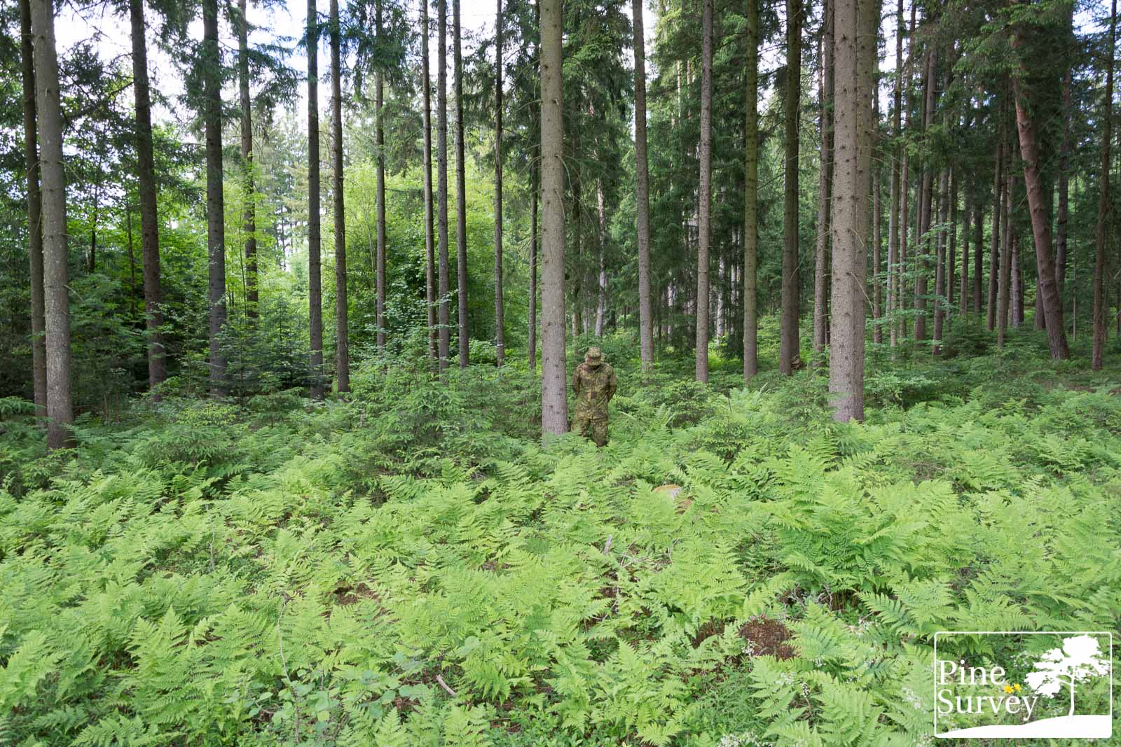
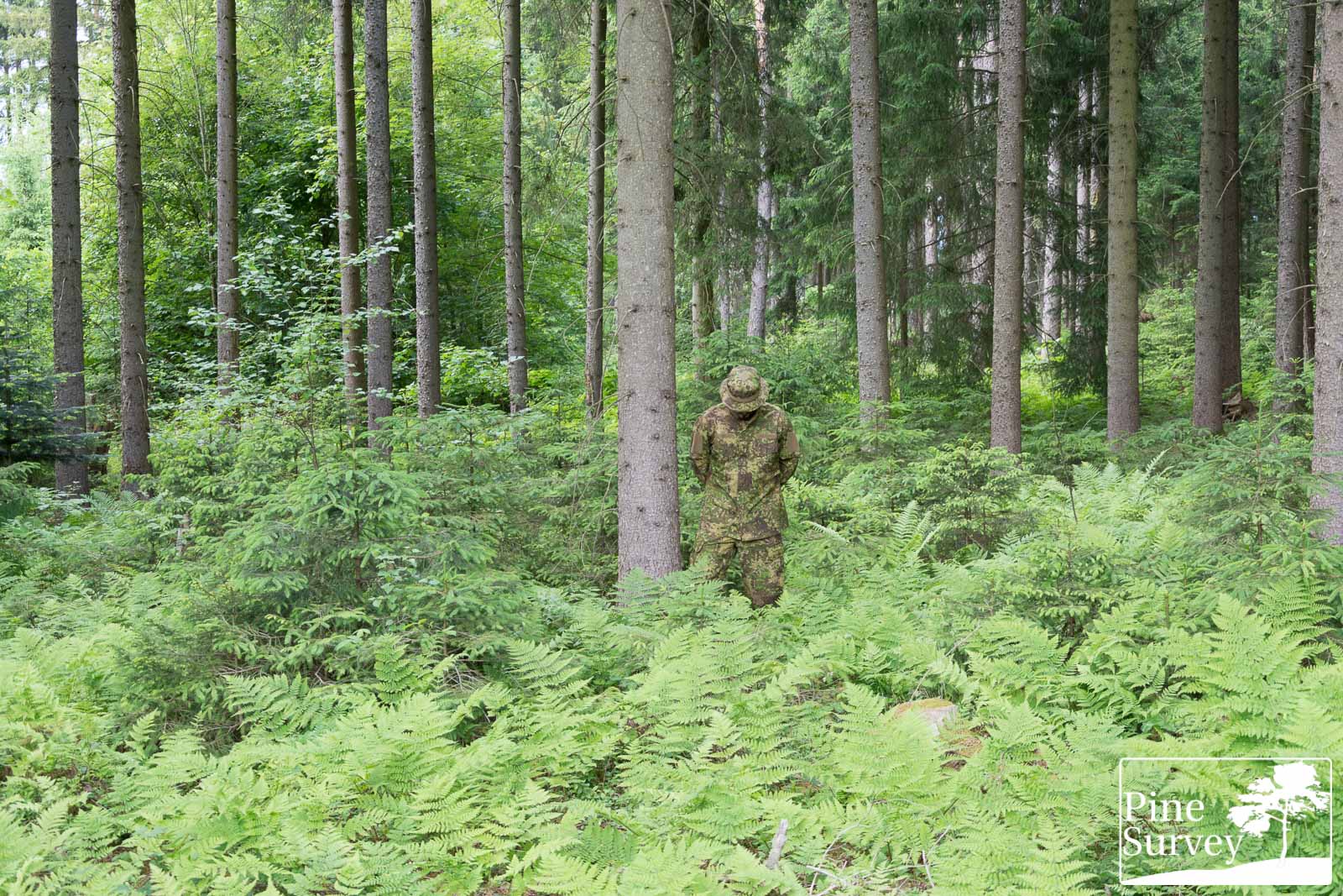
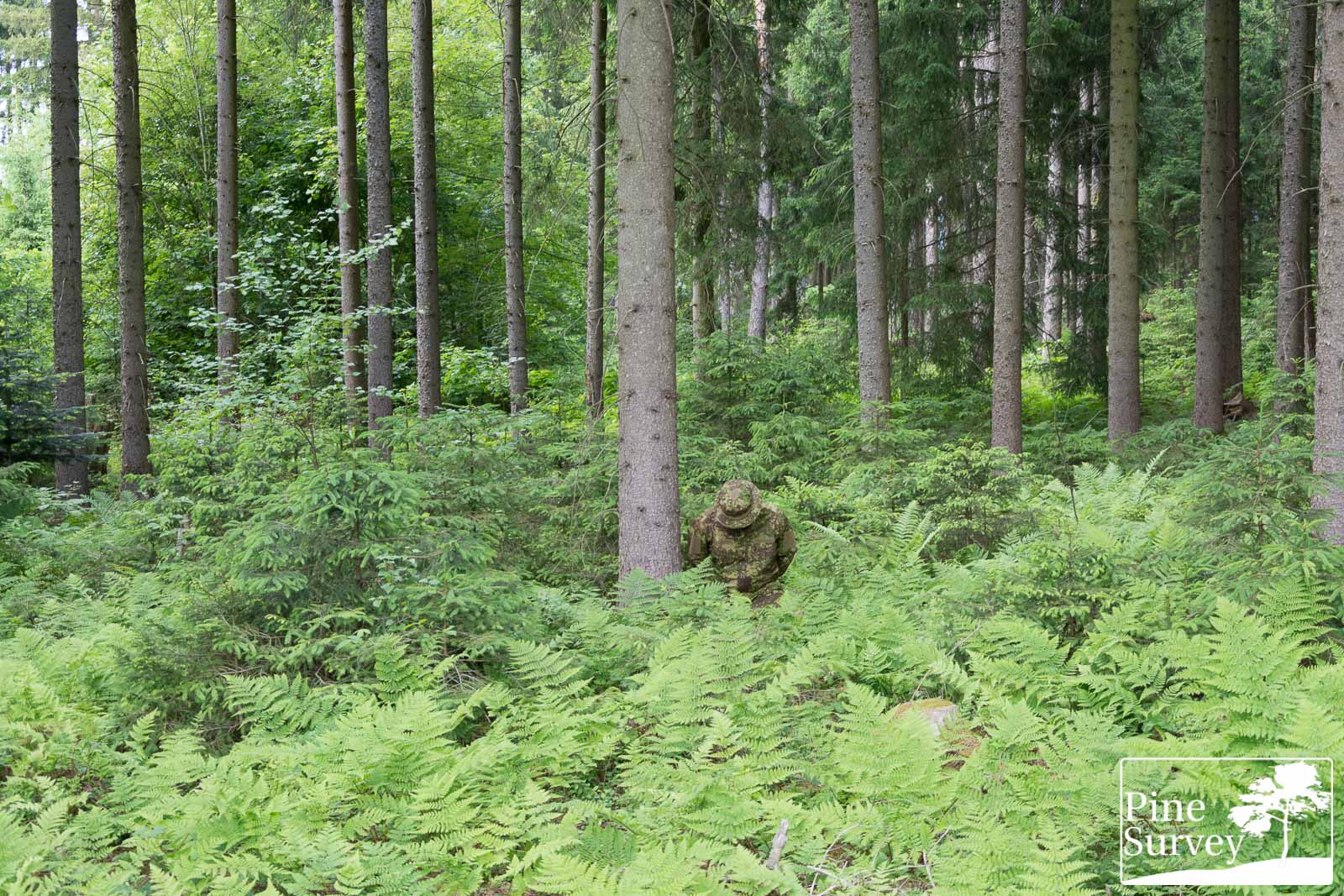
This first location is the one you know from all my field tests. It is a typical European mixed forest with a high foliage canopy and some basic bushes, ferns and little trees on the ground. These pictures were taken at the beginning of June, so all the vegetation is fresh and lush green. This is actually the most green dominant time of the year, resulting in an environment which actually would suit a solid color green uniform the best.
The pictures were taken in the afternoon under a partly cloudy sky. The camera is standing roughly 10m away from the human silhouette.
PenCott Wildwood
First of all, let’s take a closer look at PenCott Wildwood.
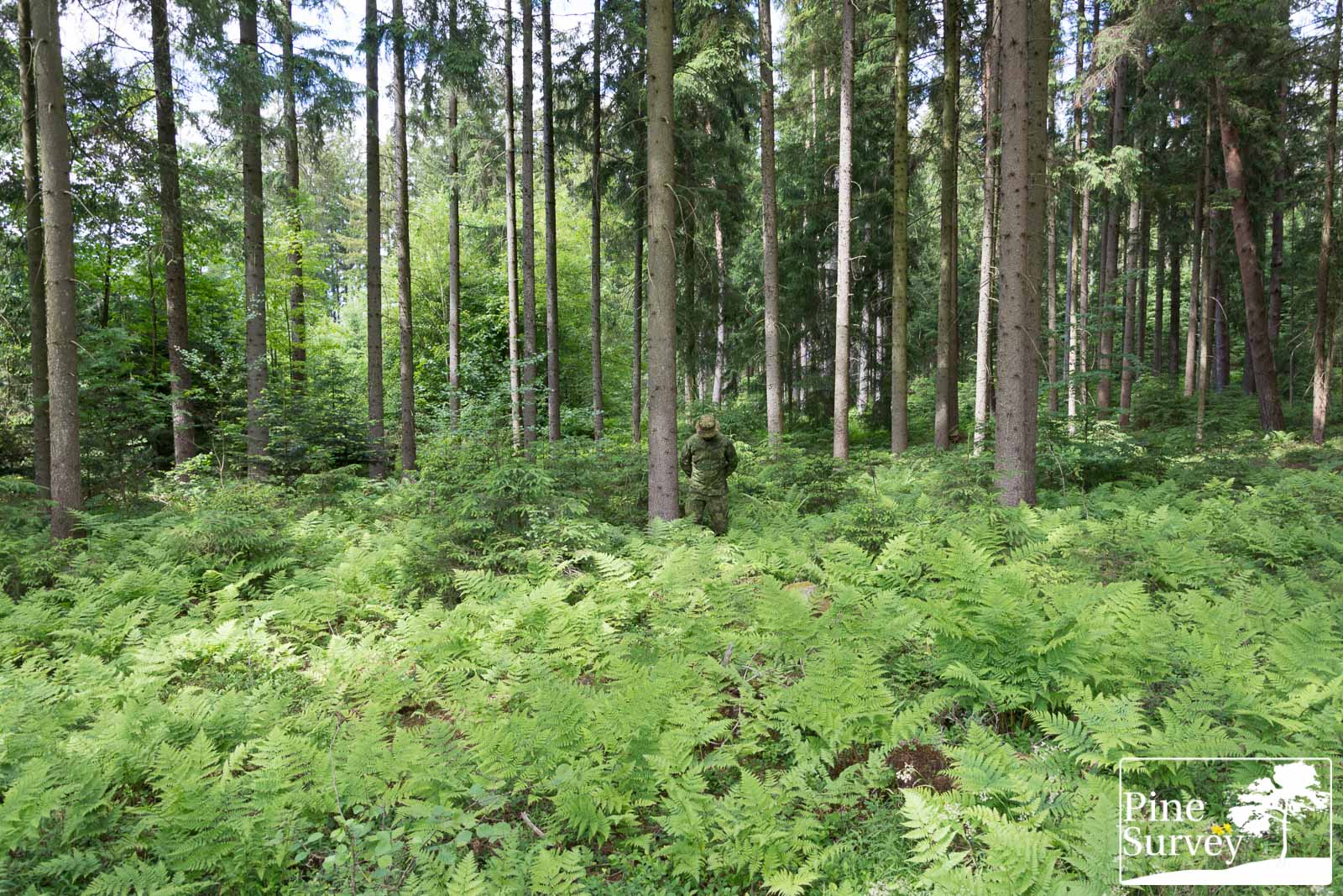
PenCott Wildwood – wide angle – standing
PenCott Wildwood – wide angle – kneeling
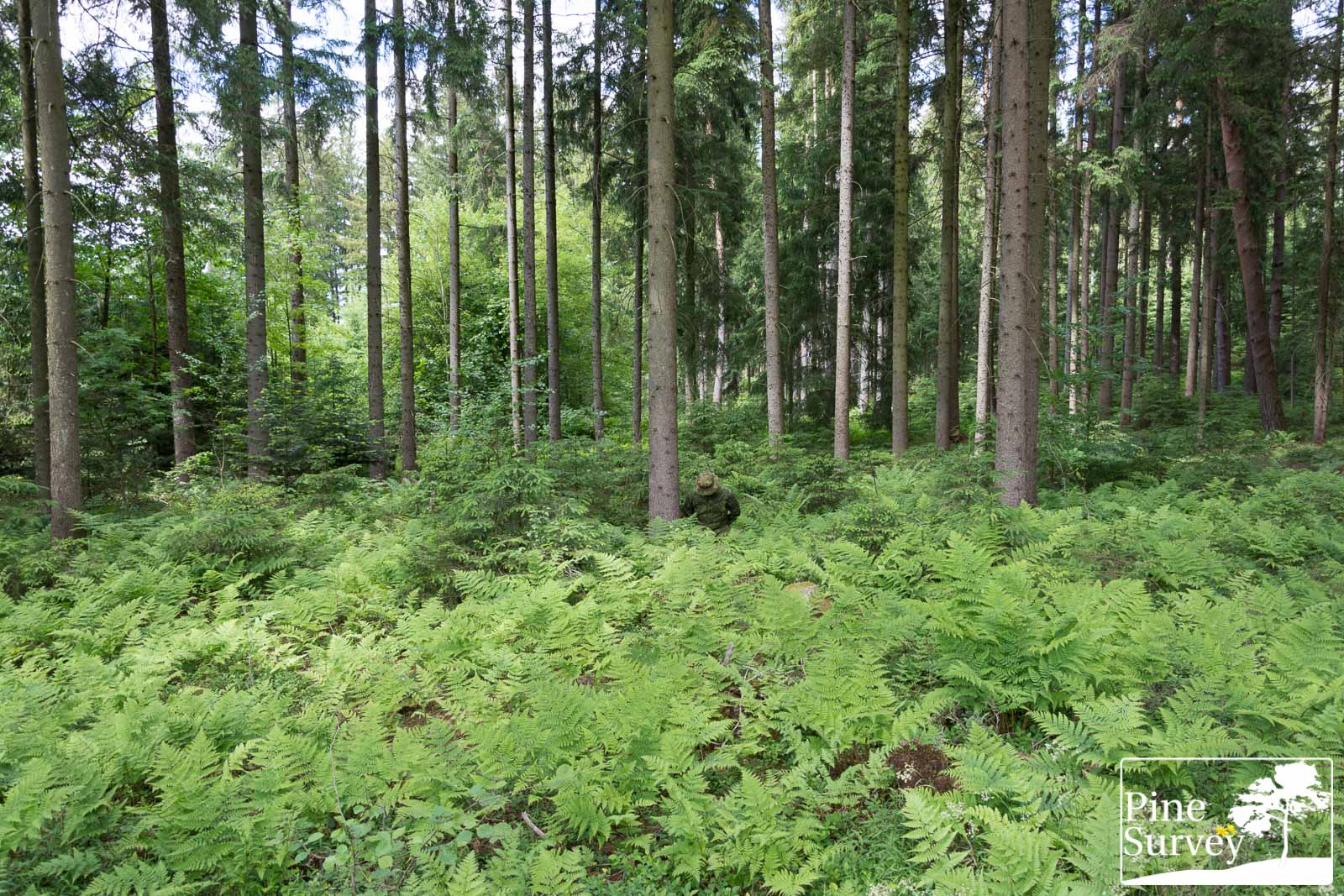
PenCott Wildwood – 35mm – standing
PenCott Wildwood – 35mm – kneeling
PenCott Greenzone
And here are the PenCott Greenzone pictures in comparison.
PenCott Greenzone – wide angle – standing

PenCott Greenzone – wide angle – kneeling
PenCott Greenzone – 35mm – standing
PenCott Greenzone – 35mm – kneeling
Observations – Location 1
Wide angle
When looking at PenCott Wildwood from a distance and making use of the wide angle lens, you can see that the colors are a perfect match to the surrounding lush green environment. Especially during this early summer period, the greens are so dominant in nature, that everything else stands out.
Despite the less visible contrast of the pattern colors, some macro elements are visible, barely breaking up the silhouette. In the standing position, the midi and micro elements create some visual noise, making the overall appearance not as monochrome as expected. When going into a kneeling position the overall appearance of the pattern changes to much darker colors, making the macro elements futile however.
35mm focal length
Changing to 35mm focal length (which mimics the human visual perception) one gets a better look at the situation. The micro and midi elements are better visible in this setting, underlining my statement on visual noise. The dark anthracite macro elements can be seen working especially on the right leg and upper chest – creating the impression of tiger stripes. When kneeling down, the appearance changes to a much darker color again.
Since the Boonie is in PenCott Greenzone, you also have a direct comparison of the two patterns, even though the round shape of the brim is a prominent marker at identifying the human silhouette (one has to keep in mind that this says nothing about the performance of either pattern, since you would not have this issue with a full Wildwood or Greenzone set, or any other pattern).
When looking at PenCott Greenzone through the wide angle lens, the difference between the two patterns becomes apparent immediately. Given the higher contrast and almost 50% tan and brown colors of Greenzone, the macro elements are better working when it comes to disruption. But while the green elements perfectly match the surrounding, the blending effect is not as apparent as with Wildwood (given its green dominant nature).
Kneeling down presents a different picture. While not as dark as Wildwood, PenCott Greenzone is not as good at blending in this time of the year, given the different shades of brown and tan, which stand out in this lush green environment.
Taking a look at the 35mm focal length pictures, several statements from above come to mind. Micro, midi AND macro elements are visible, doing a balanced job in blending and disrupting. Especially at close range the impression of “looking through” is being created. Kneeling down is one of the best ways to conceal the human silhouette after all. The macro elements disrupt the shape, while the boonie disguises the round shape of the head (with the brim not as apparent as before).
Location 2
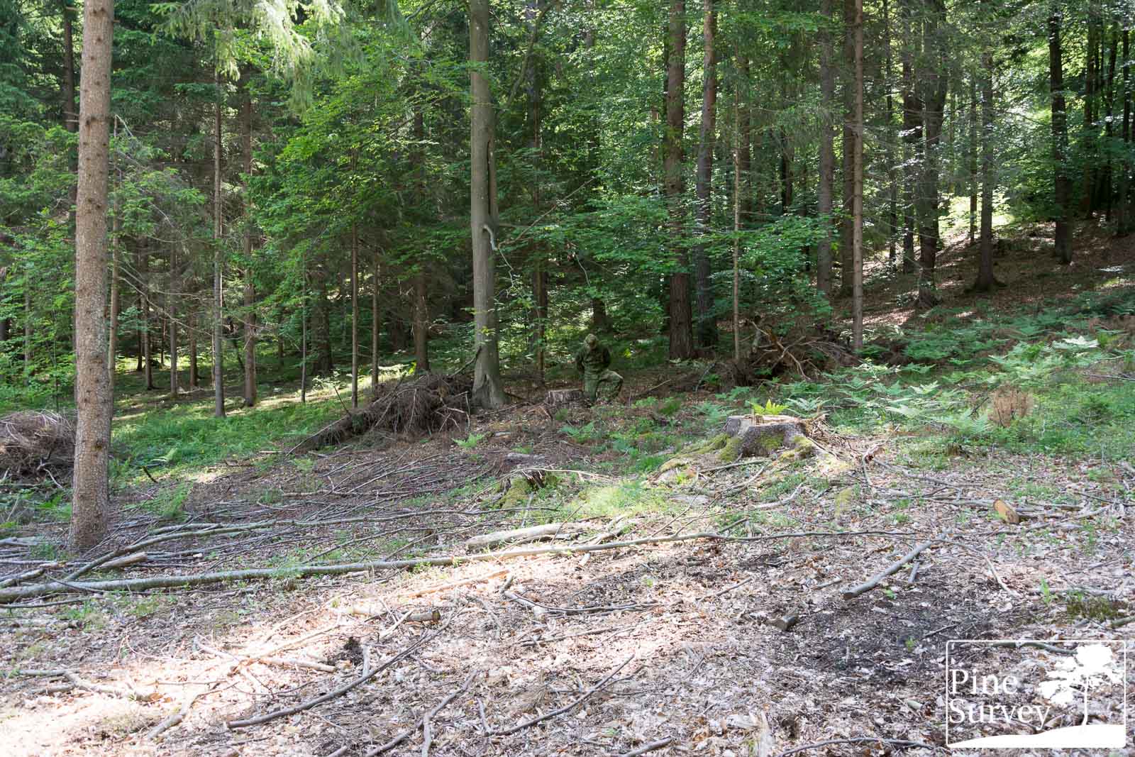
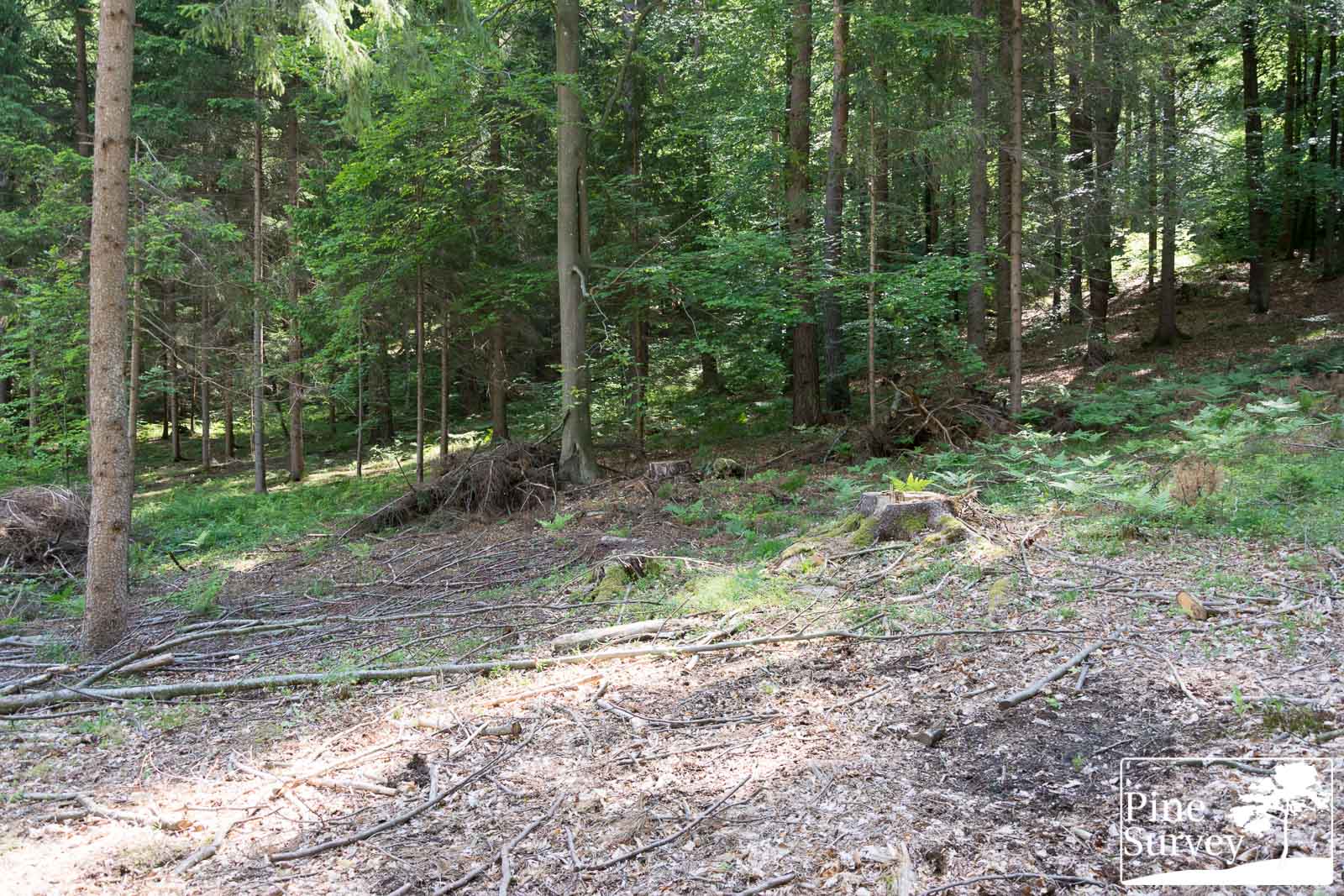
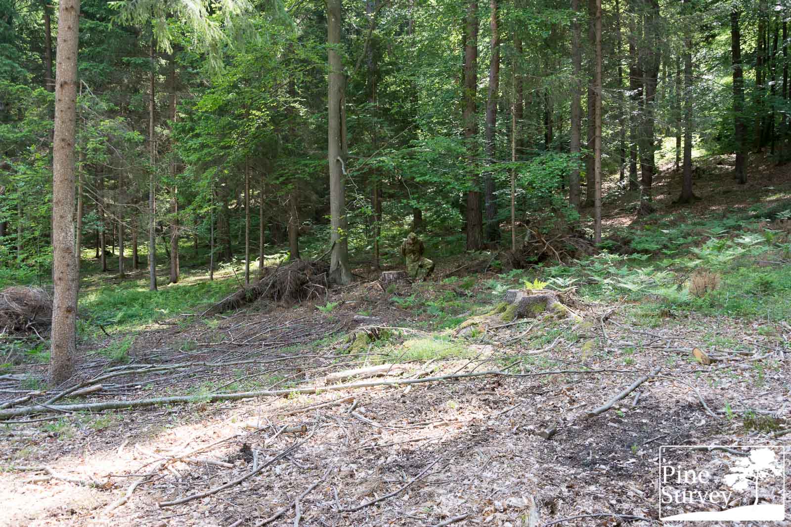
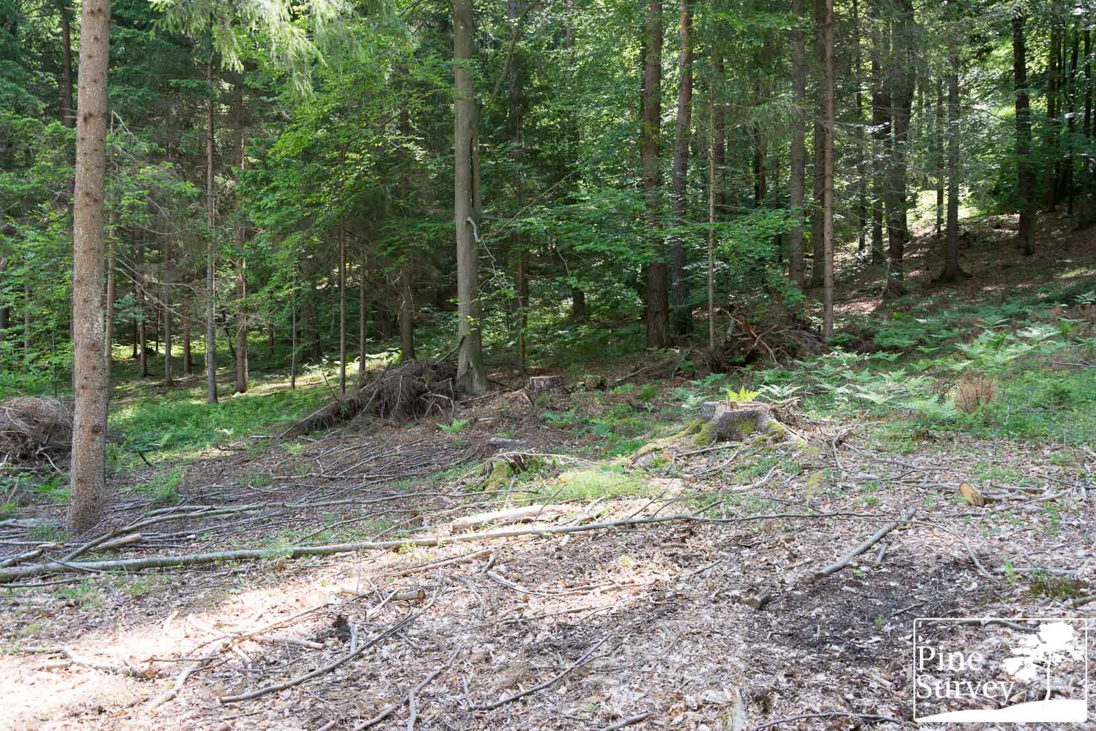
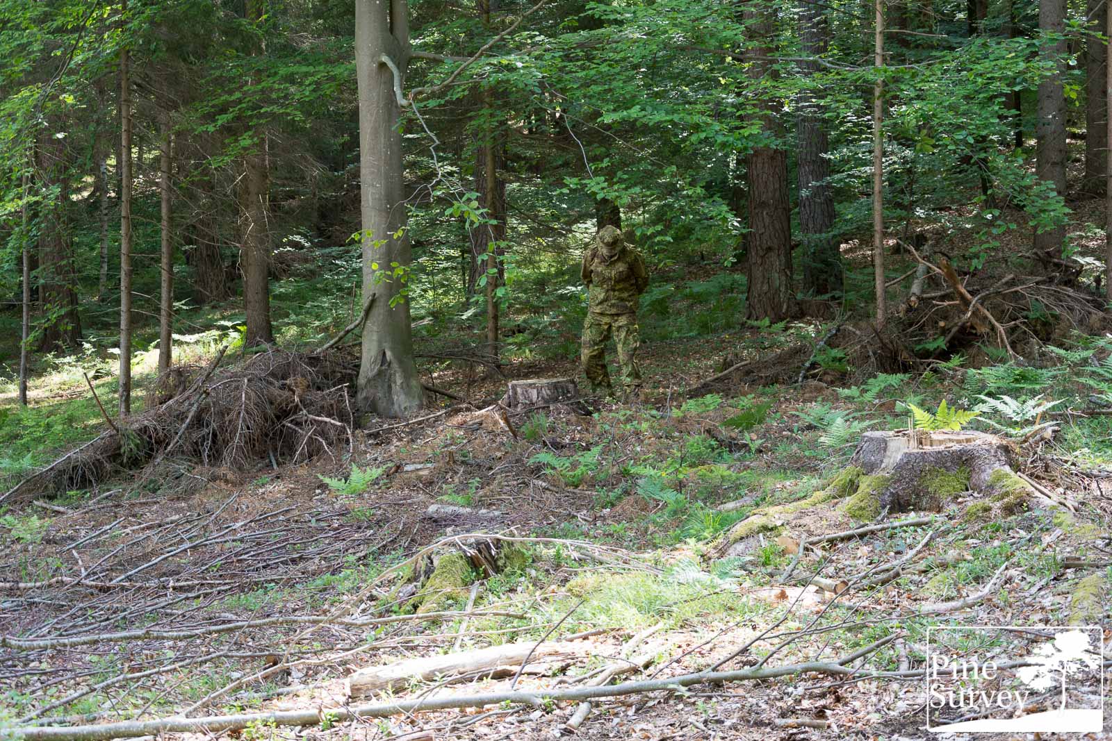
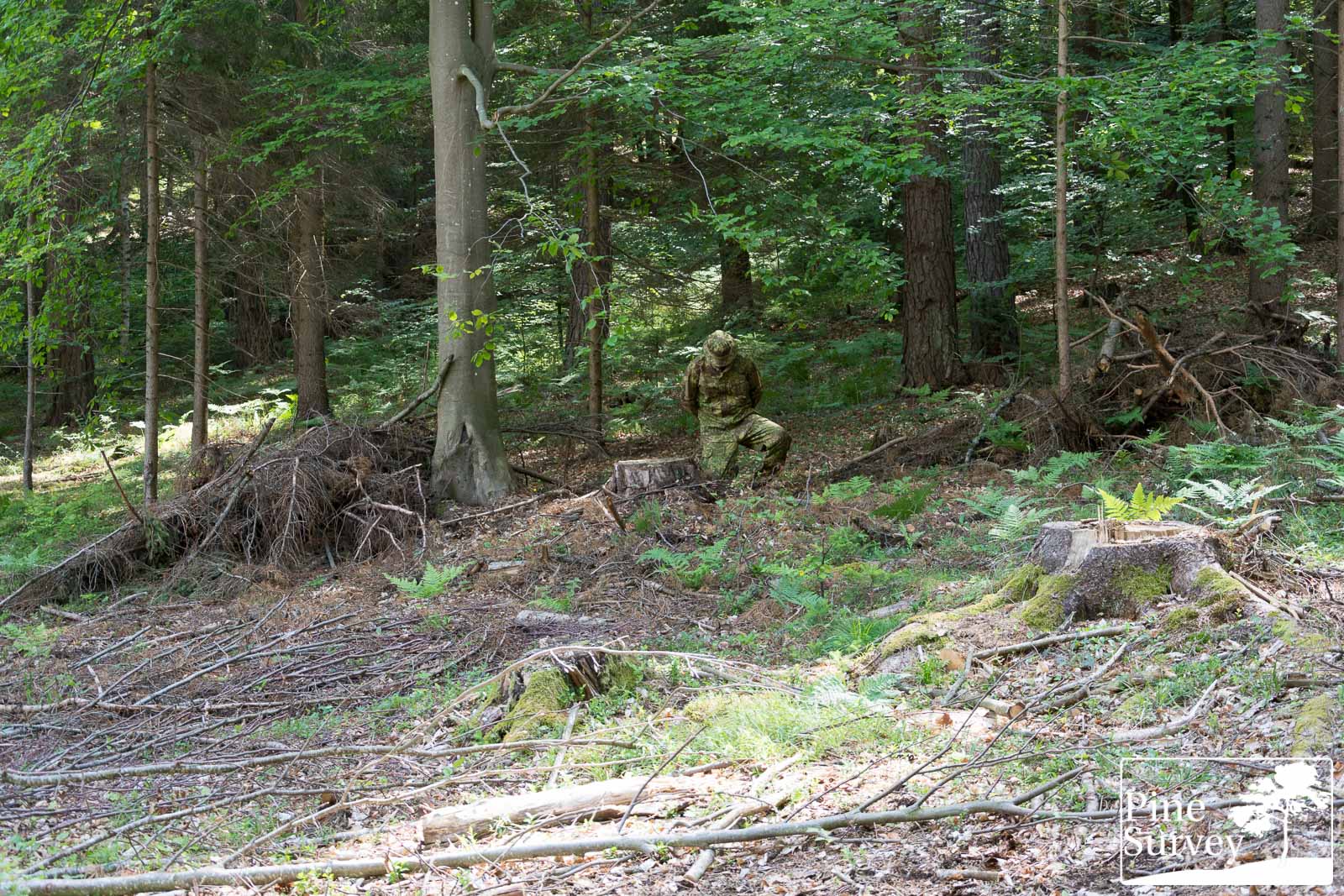
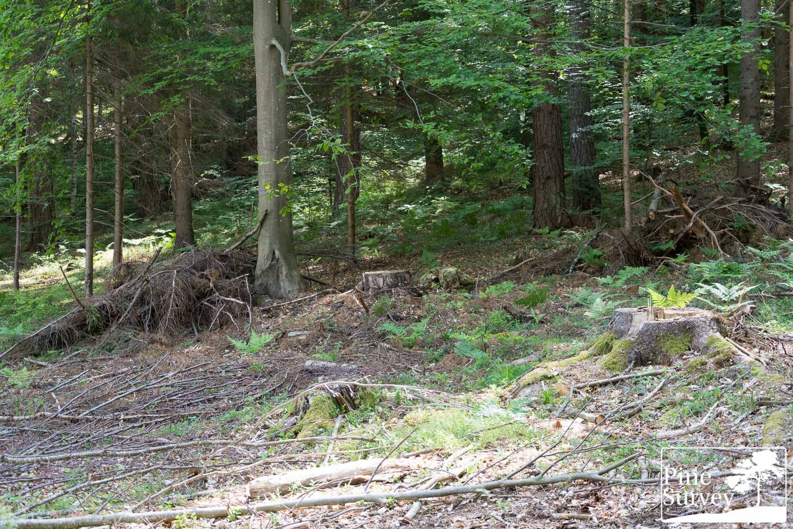
This location is a mixture of deciduous and coniferous forest. You will find strong contrasts between brown and green vegetation, a slightly denser undergrowth and a partly closed canopy, with a clearing on the side.
Only recently this location was strongly worked on. Deforestation is an issue and the tree I usually lean on is gone. I tried to recreate the usual scene as best as I could. The forest floor is covered with beech leaves, and cut branches. The pictures were taken before noon, under a partly cloudy, but bright sky.
The camera is standing roughly 15m away from the human silhouette.
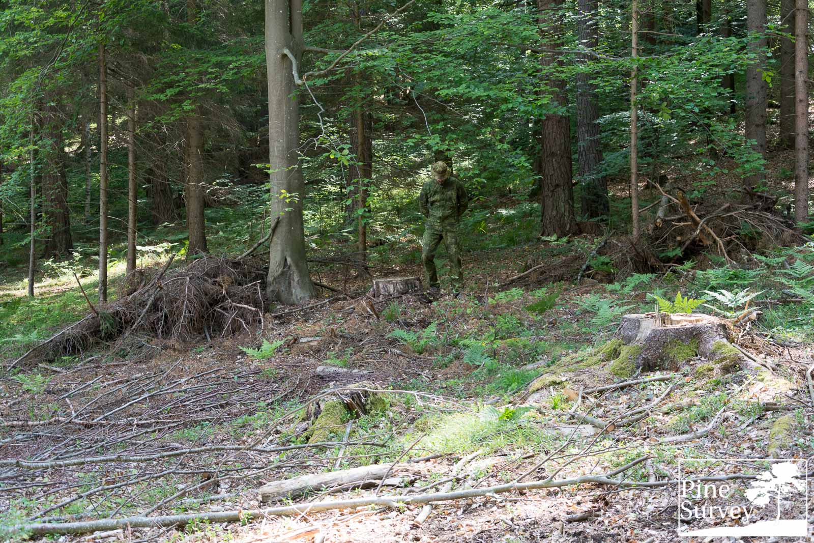
PenCott Wildwood
As before, PenCott Wildwood at first.

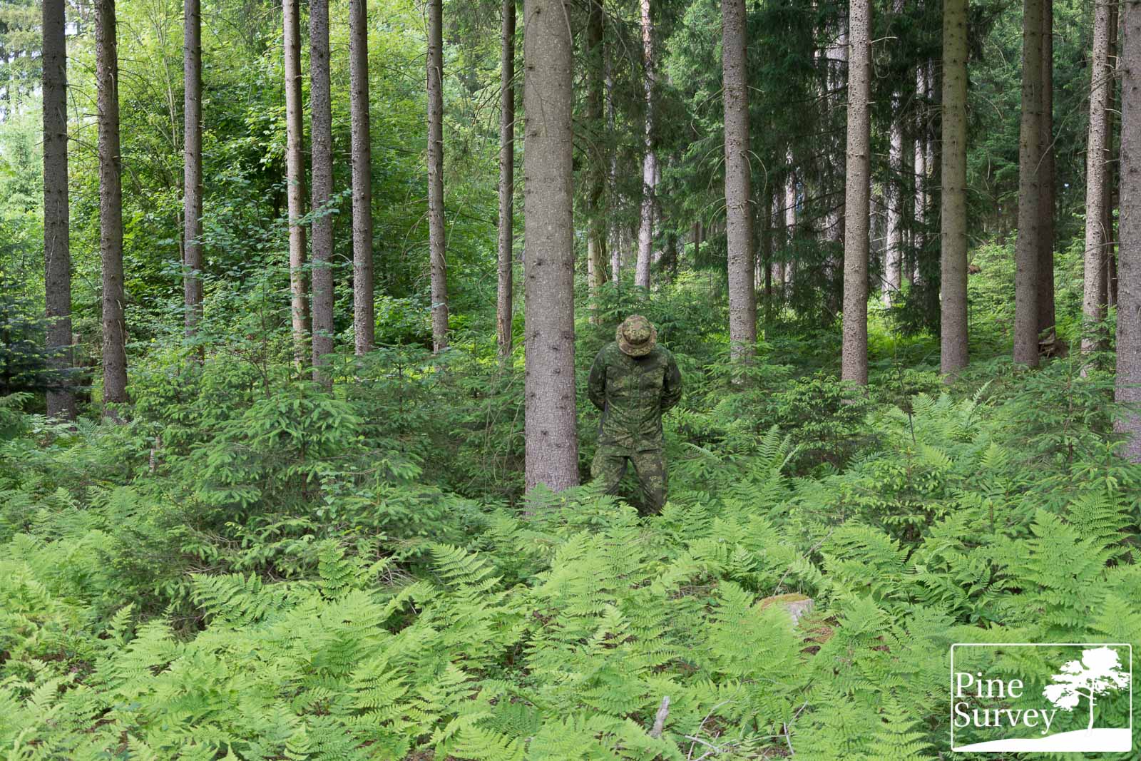
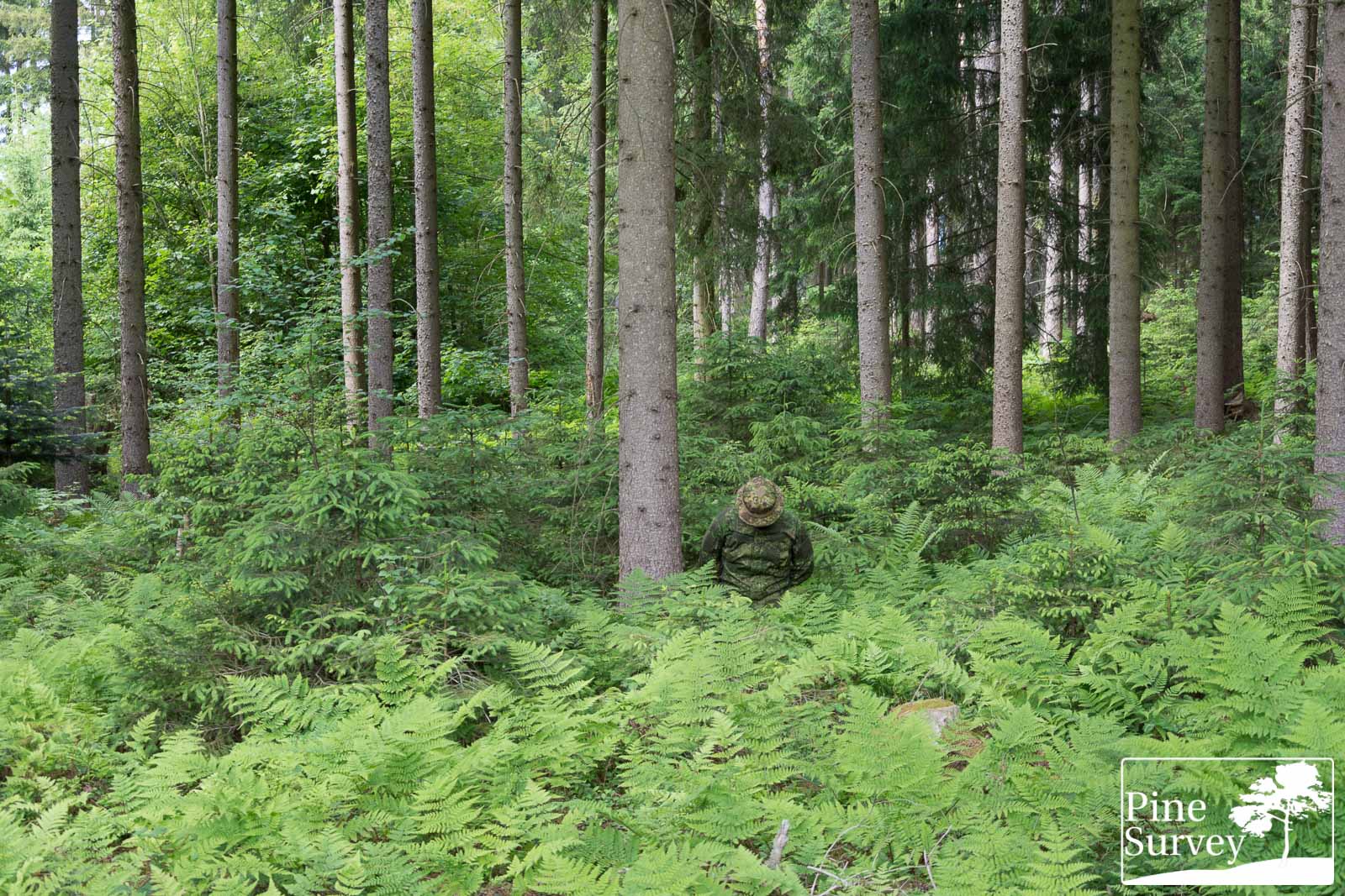
PenCott Wildwood – wide angle – standing
PenCott Wildwood – wide angle – kneeling
PenCott Wildwood – wide angle – prone
PenCott Wildwood – 35mm – standing

PenCott Wildwood – 35mm – kneeling

PenCott Wildwood – 35mm – prone
PenCott Greenzone
And PenCott Greenzone in comparison.

PenCott Greenzone – wide angle – standing
PenCott Greenzone – wide angle – kneeling
PenCott Greenzone – wide angle – prone
PenCott Greenzone – 35mm – standing
PenCott Greenzone – 35mm – kneeling
PenCott Greenzone – 35mm – prone
Observations – Location 2
Wide angle
This particular setting is way more balanced in terms of colors and vegetation. It gives a better impression, because it is not fully covered in fresh grass or ferns.
Starting with the wide angle pictures, the standing position presents an excellent effect in blending. At this distance, the elements blur together however, being a direct result of the lacking contrast of the colors. Some lighter areas can be identified.
When kneeling down, PenCott Wildwood becomes darker again in its overall appearance. One or two macro elements are perceivable, the rest of the color variations is a direct result of light and shadows. The prone position barely gives something away, given the minimal exposure of the body.
35mm focal length
The 35mm focal length gives a more detailed impression. The dark macro elements can be identified now. Given the lucky positioning of the pattern on this shirt, the look and feel of tigerstripes is being produced. Bright tan midi elements and the green dominant color of the pattern, create a particular blending effect.
Kneeling down works just as good, even though the pattern becomes darker again. The midi and macro elements work however in blending and disrupting. The prone position makes the body basically disappear in the undergrowth.
Looking at PenCott Greenzone in the standing position (and also with wide angle), the disrupting effect of this PenCott variation immediately becomes apparent. Next to blending into the surrounding environment using its colors, the high contrast of the brown macro elements is creating the above mentioned “see through” effect.
When kneeling down, this becomes more apparent. Especially the left side of the body basically merges into the background, while the torso is disrupted by a large brown macro element. The prone position is as always an ideal concealment method, making any comment unnecessary.
The pictures using 35mm focal length make my statements clearer. While the green elements of PenCott Greenzone blend with the background. The brown and tan midi and macro elements disrupt the human silhouette. The “see through” effect is much more apparent in this pictures, as with the wide angle. The same can be said about the kneeling position. The knee on the ground blends in perfectly, while the macro elements on the torso disrupt. Going into the prone is also the most effective setting in this case. No comment needed.
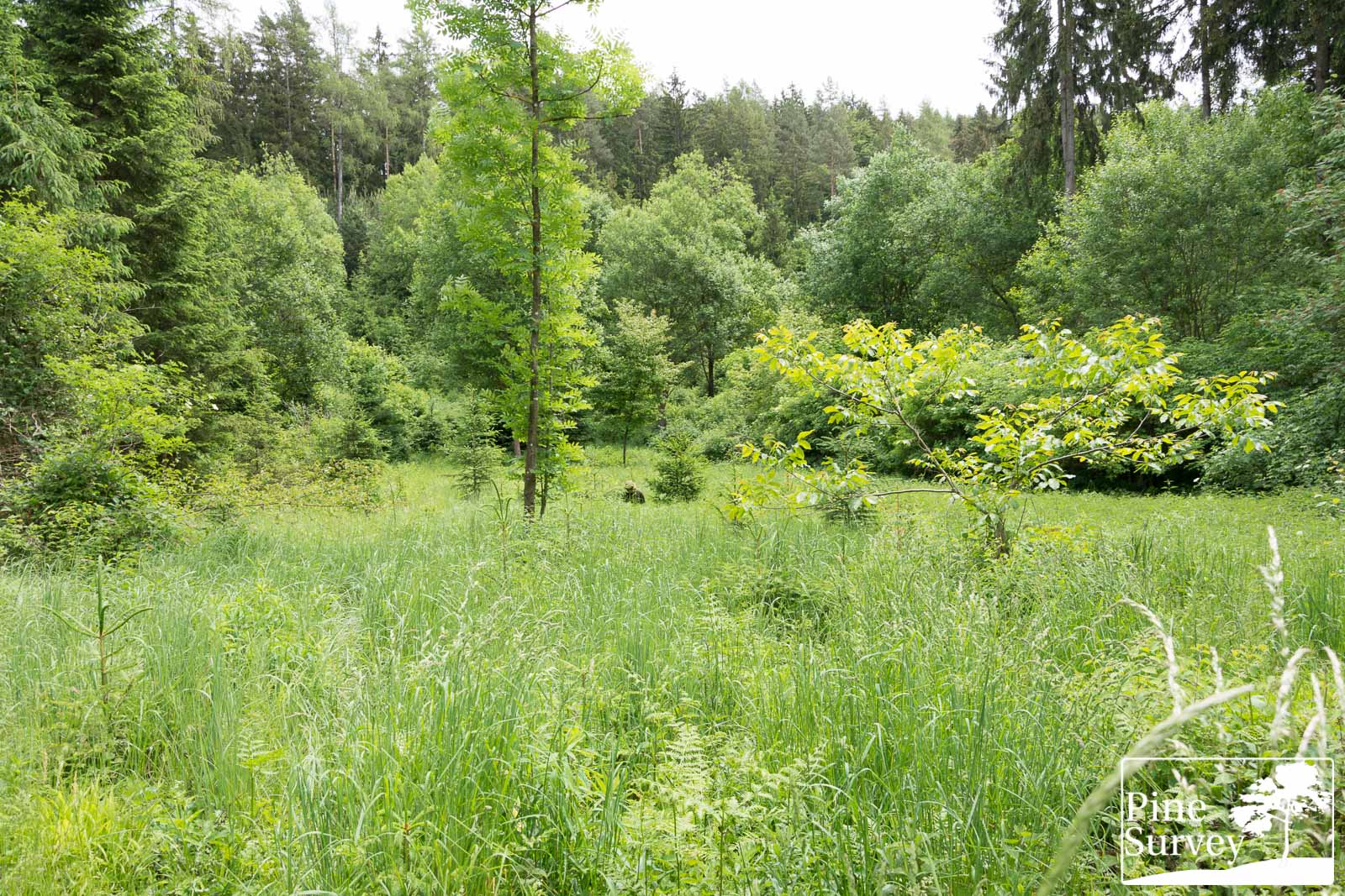
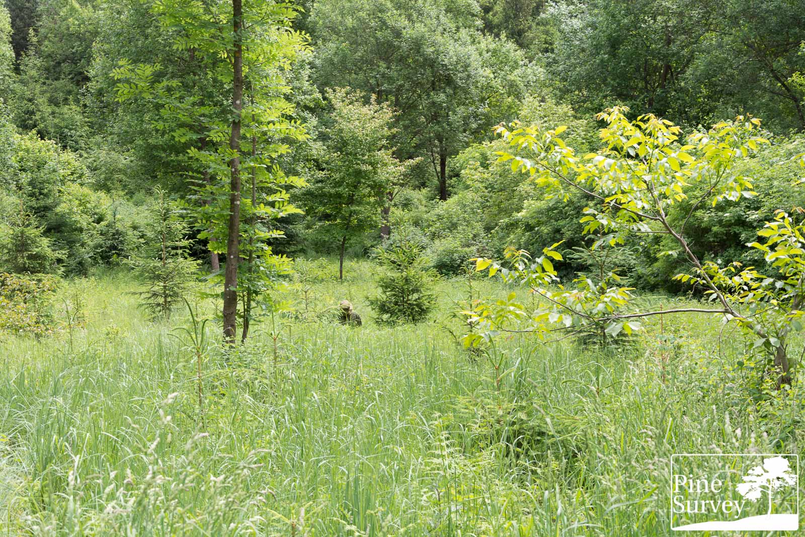
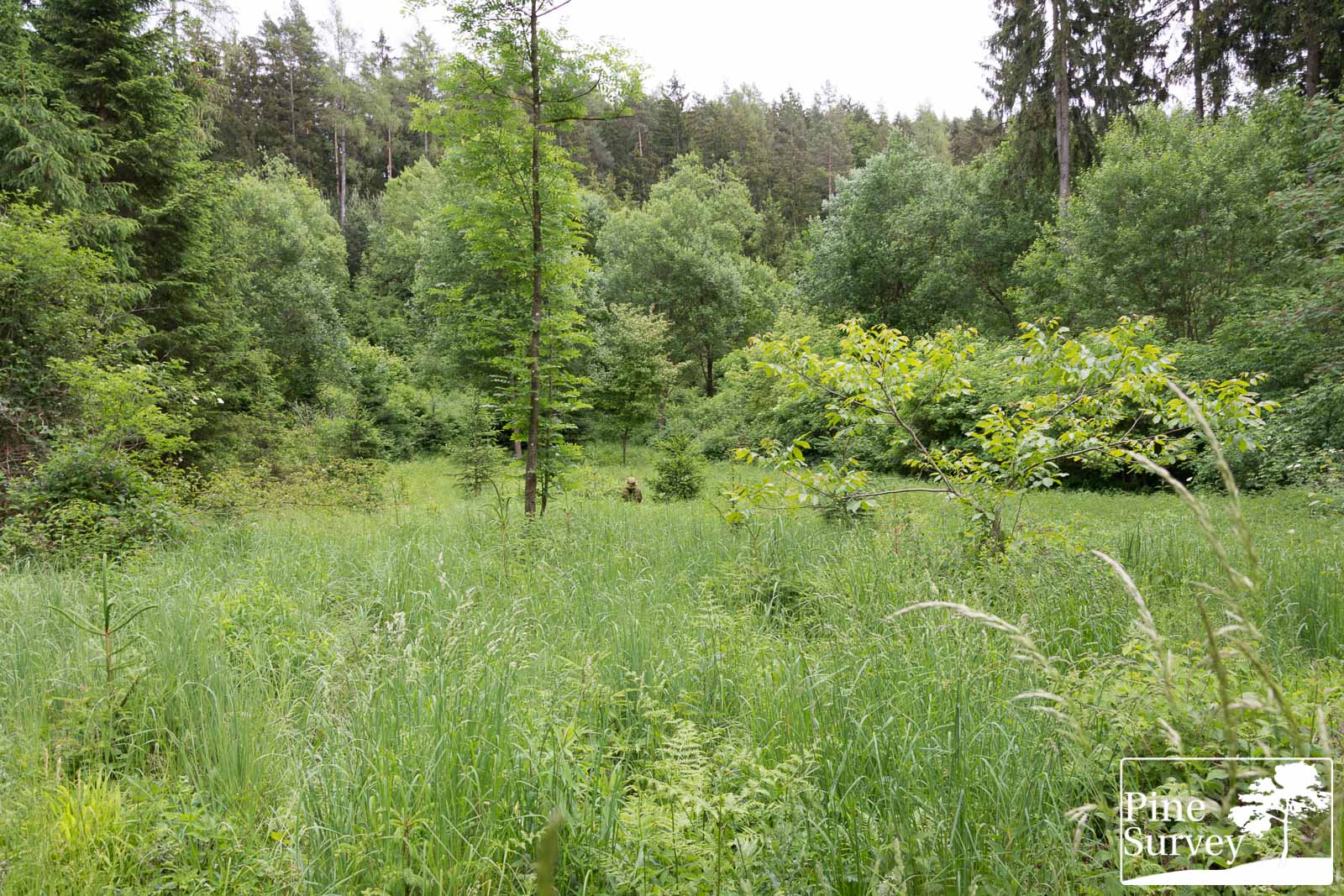
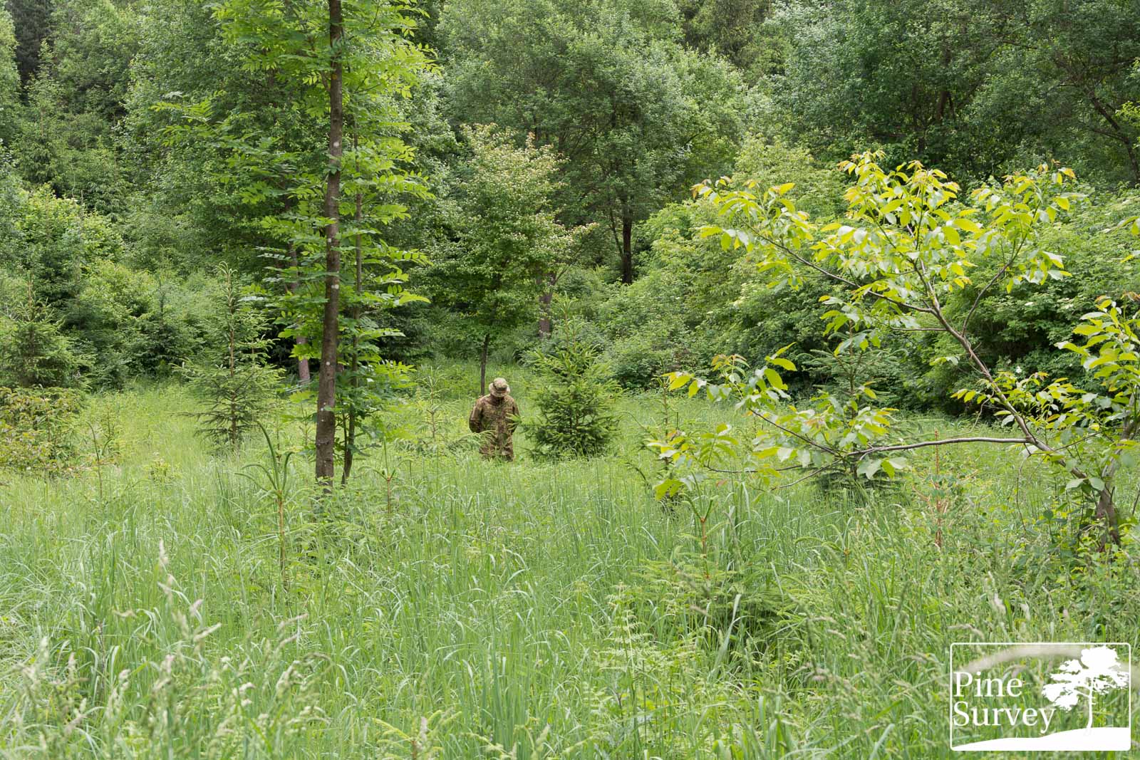
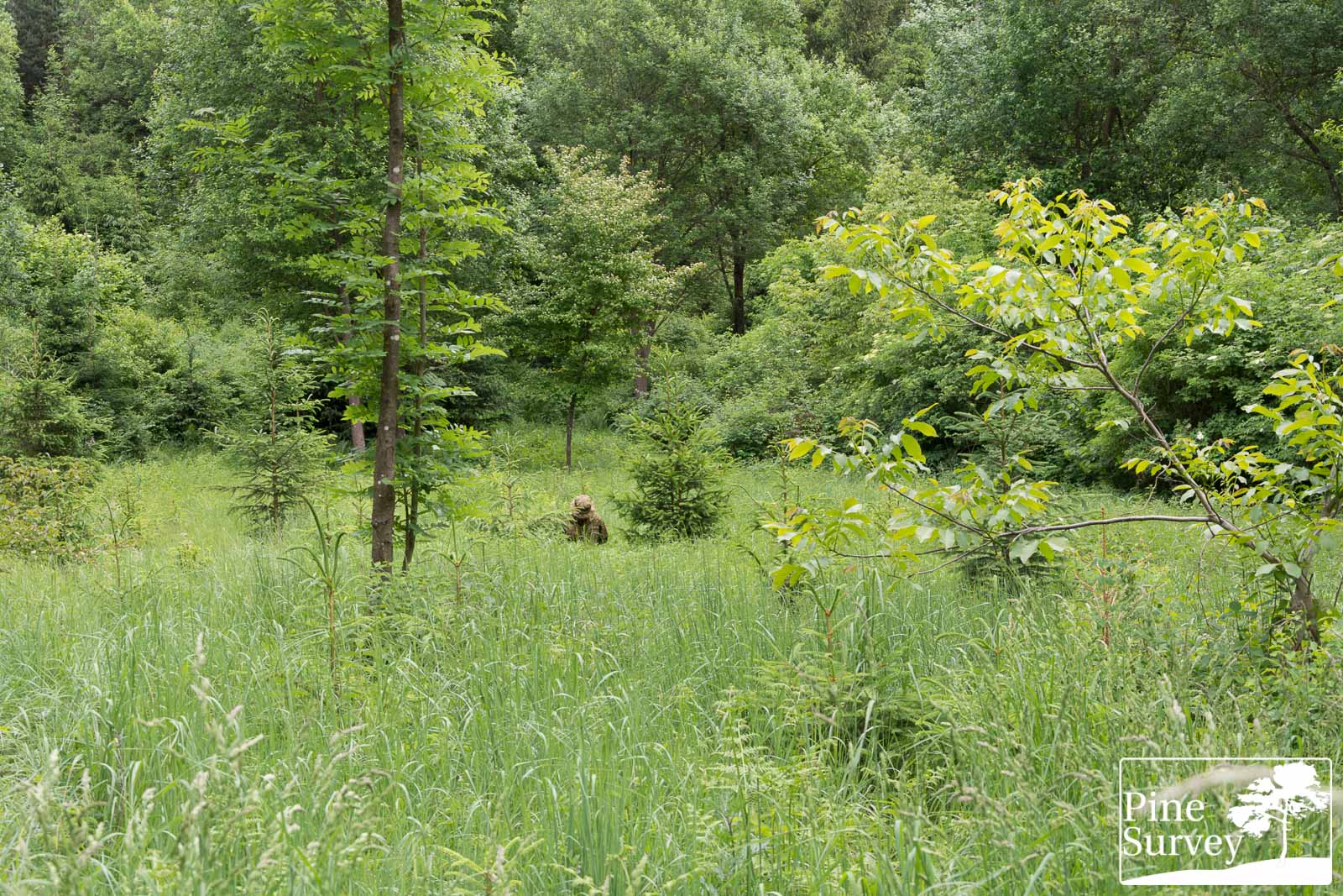
Location 3
You know this site from my “Eyes in the Sky” field test. It is an open field in a mixed forest, with random conifers, some deciduous trees as well as high grass.
Just like with Location 1, this site is completely monochrome and lush green. Even though the camouflage effect is barely zero here, I decided to use the location for the sake of completeness.
The camera is standing roughly 20-25m away from the human silhouette. In this location I left out the prone position since I would be covered by undergrowth.
PenCott Wildwood
As before I will start with PenCott Wildwood…

PenCott Wildwood – wide angle – standing
PenCott Wildwood – wide angle – kneeling

PenCott Wildwood – 35mm – standing
PenCott Wildwood – 35mm – kneeling
PenCott Greenzone
and follow with PenCott Greenzone

PenCott Greenzone – wide angle – standing
PenCott Greenzone – wide angle – kneeling
PenCott Greenzone – 35mm – standing
PenCott Greenzone – 35mm – kneeling
Observation – Location 3
The long distance of 20-25m in combination with the wide angle lens present a good impression on how PenCott Wildwood performs at long ranges.
Wide angle
While the colors should match the surrounding environment, the overall appearance while standing is a darker one. The macro elements are barely visible, making the uniform a dark green and unicolored spot. When going into the kneeling position, this barely changes. Given the lowered profile the human shape disappears, leaving a dark spot however. In comparison the Boonie hat in PenCott Greenzone blends into the surroundings.
At 35mm focal length the performance looks better, and not as dark. The dark macro elements are better visible, and again, provide a tigerstripe effect, because of the placement on the shirt. When kneeling down, the above stated observations apply.
In comparison, PenCott Greenzone has a different problem in this monochrome and lush green setting. While not being as dark as PenCott Wildwood, the big percentage of dark brown elements is standing out, not able to blend into the purely green grass field. While there is a disrupting effect by the macro elements, it is not aggressive enough to break the human silhouette in this setting. In the kneeling position the performance is supported by the high grass, making the body less visible. In this setting the colors look more organic and natural however, than those of Wildwood.
35mm focal length
Looking closer with 35mm focal length, there is barely something to add. The same statements as above apply. However, you get a better look at the organic look of Pencott Greenzone and the various macro and midi elements, which create the already mentioned “looking through” effect.
In the end, this example shows clearly, why the military trains its soldiers to avoid open fields with no cover. Human silhouettes will always stand out, especially when standing or moving.
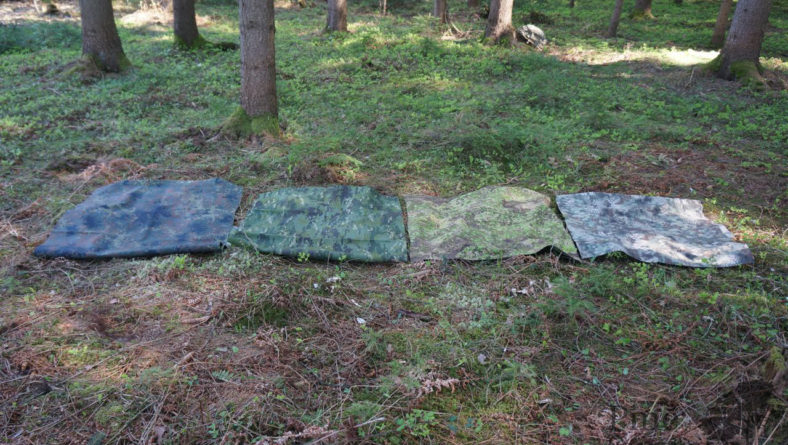
Addendum:
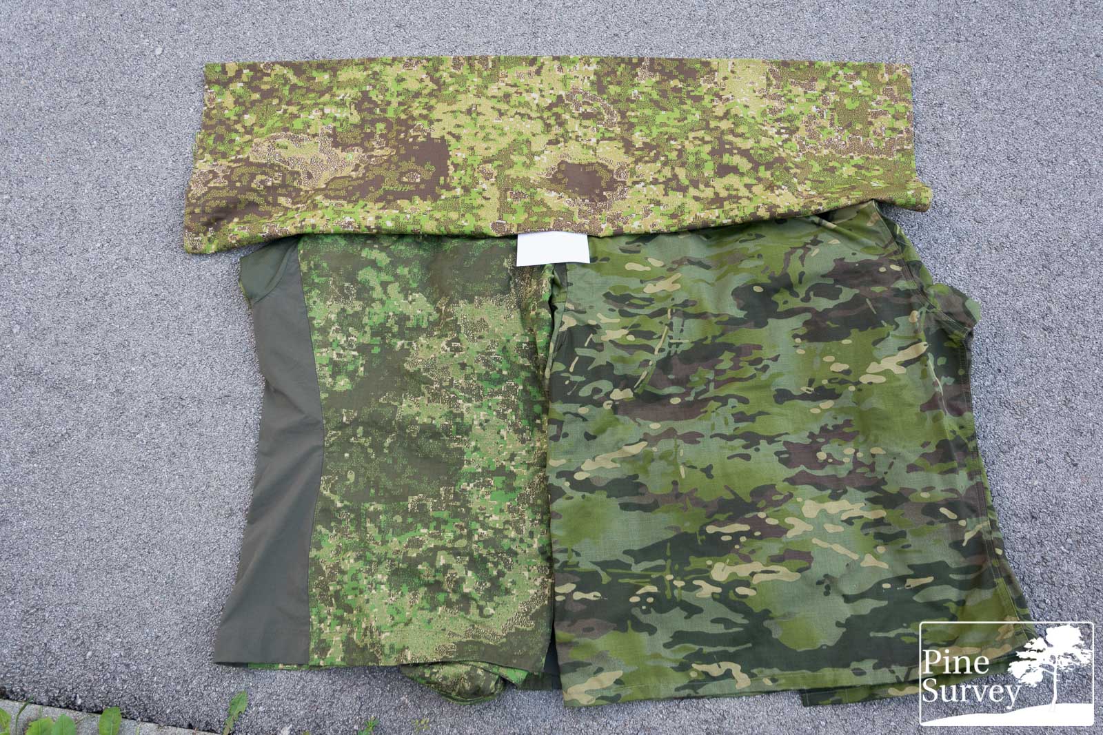
I want to share two more pictures. First one with both shirts next to each other on the ground. It is a perfect example for the difference of „blending“ and „disrupting“. Both patterns perform well, by implementing different ways to conceal: blend and disrupt. In the case of PenCott Greenzone, it is more of both. Meaning: Wildwood seemingly melts into the background at this very short distance. And while Grenzone blends as well, it also disrupts… making it also perform at longer distances, where other patterns melt into a solid color.
Two shirts blending and disrupting
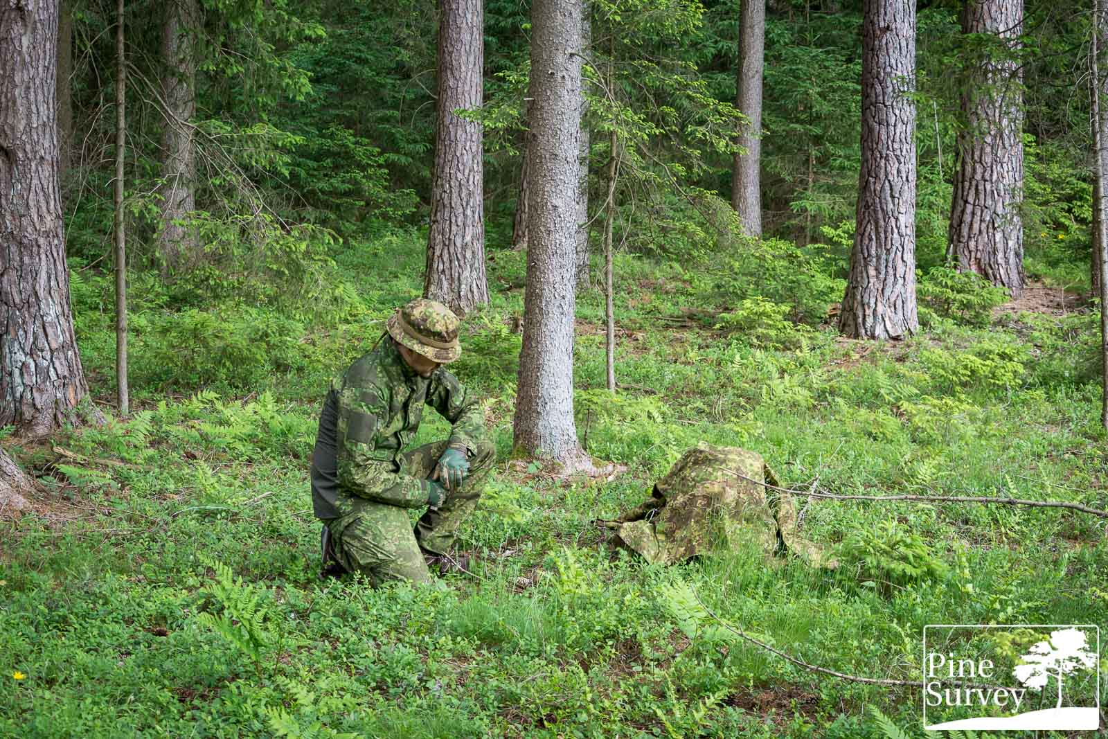
Another picture is a teaser from my Eyes in the Sky series. A top down picture of PenCott Wildwood in the open field. It shows how the birds eye perspective changes everything – issues, which I touch more thoroughly in the drone articles.

PenCott Wildwood – top down look from 10m height, wide angle
Conclusion
To be perfectly frank, and I did mention it on several occasions, I was never a real fan of PenCott Wildwood. The discrepancies in the fabrics/prints, the close familiarity to PenCott Greenzone, as well as the exclusiveness to Helikon-Tex/Direct Action were issues that bothered me.
Having had the chance to take a closer look at it – meaning the NyCo MBDU (!) – I must say that I was pleasantly surprised by the performance in lush green environments. While it does not make full use of the excellent PenCott pattern geometry and its organic looks, because of the color choices, the blending effect of the green dominant colors is obvious.
Personally I would love to see the Green of Wildwood in PenCott Greenzone, or the Brown of PenCott Greenzone in Wildwood, but that would lead to even more confusion in the already complex pattern family.
Having this in mind, I hope that Helikon-Tex will take care of the consistency issues regarding the print. It would only be fair enough for the huge fanbase this pattern has gathered.
With that being said, I want to thank Perunika for making this review possible. Many thanks to my Patreons for supporting the blog!
Take care!
1 thought on “Field Test: PenCott Wildwood vs Greenzone”