

Introduction
ConCamo is a fairly new camouflage pattern which debuted on this years IWA at the booth of Leo Köhler. In a time when new camouflage patterns have a rough time, because of the oversaturated market and the end of the US Army Camouflage Improvement Effort, which brought the camo gold rush to an abrupt ending, ConCamo managed to get the attention from end users and interested observers alike.
By now there are several reviews out there, showing the pattern and its effectiveness. Recently I also managed to get a set in my hands – reason enough to put the pattern through its paces and test out, what all the Fuzz is about, and if it is for good reason.
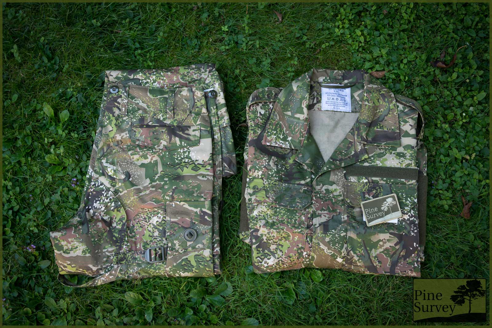
ConCamo uniform by Leo Köhler
This is the first of two reviews. While I will focus on ConCamo in this article, I will give you a comparison to other camouflage patterns in a follow up later on.
The man behind ConCamo
Before I start with the camouflage pattern itself, I would like to take a closer look at the person behind it: Matthias Bürgin.
He is the founder and the mastermind behind ConCamo and has a longstanding fascination with camouflage as a topic. According to himself it started at the age of 10 years, when he started to experiment with camouflage. Bürgin later joined the German Armed Forces and served as a paratrooper for several years. As a result, further preoccupation with camouflage came with the job.
After leaving the army, the fascination with camouflage stayed on and his hobby of designing camouflage patterns reached the next level when he started to delve into research on perceptual psychology. With the science on how to confuse the human subconsciousness by using certain pattern arrangements, he designed what is now marketed as ConCamo, which is short for Confusion Camouflage.
ConCamo “green” – the pattern
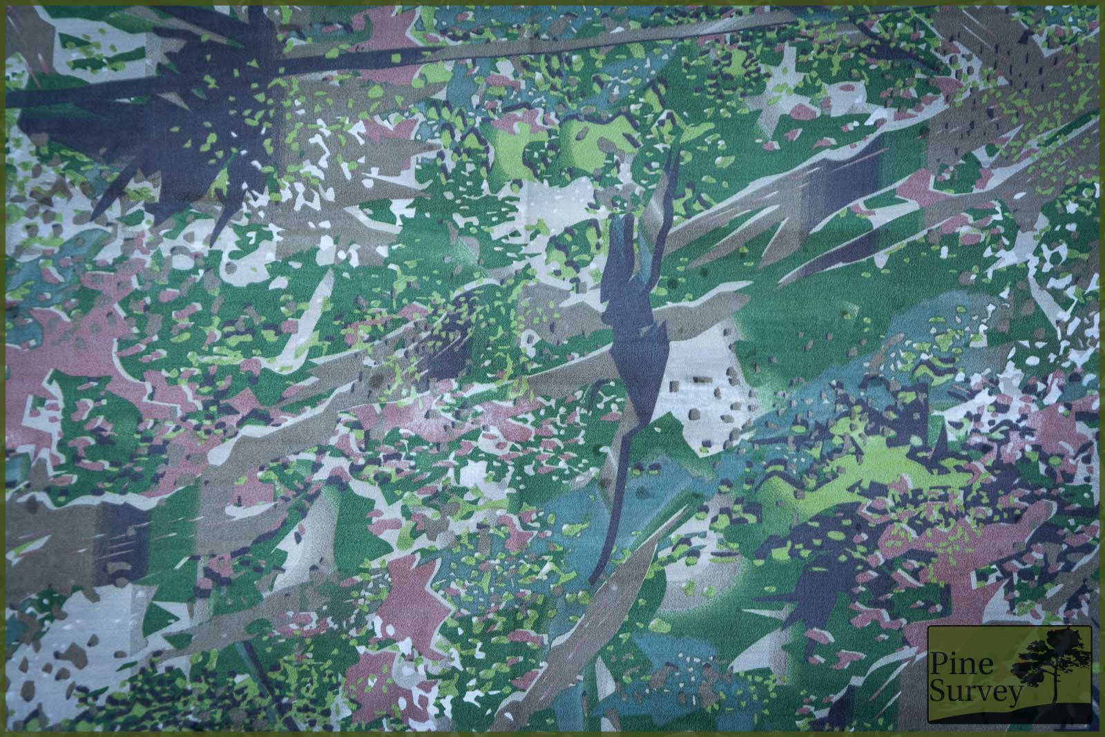
Currently the green variant of ConCamo is being introduced to the market, with others in the pipeline. As already mentioned in my first post about ConCamo, right after IWA, the pattern consists of 8 colors which are mixed through various pattern elements and shadings, resulting in over 60 layers of perceivable depth.
ConCamo – the pattern
You will find micro, midi, and macro elements, which are using several established camouflage patterns in their own distinct way. For example there are macro and midi elements using different brown tones and patterns which are looking familiar to the DPM, bushtroke and tiger stripe patterns. In doing so the first impression coming to mind is branches, obviously.
The rest of the midi elements consist of typical asymmetrical shapes and are complemented by various micro elements which look like clusters of drops. Basically as if you had taken a brush and thrown paint in little drops on a canvas.
The background itself is an even mix of khaki and green. As a result, and especially at longer distances, this creates the impression of looking through brushwood. This has also a side effect which I have come to know from PenCott Greenzone: depending on the surroundings, the human brain perceives on or the other colour as dominant, therefore making the pattern blend in. For example: brown environment – the brain focuses on the browns of the pattern. Same effect with green. It is as if you are switching between negatives of a picture.
Coming back to the pattern: The result is actually a quite dense looking camouflage, which you could describe as “noisy”. In that sense, the name “ConCamo” is doing itself justice.
Another thing worth noting is the different kind of fabric: ConCamo is printed in Germany in a facility that produces materials for several national armies. The fabric follows German Army specifications and is IRR treated. The material itself is Twill with 65% cotton and 35%polyester, which should give the fabric a better resistance towards melting than standard 50/50 NyCo. I am deliberately not using the phrase “no melt, no drip”, because that sentiment is just a nice lie of the fabric industry (read Uf Pro’s article about that issue here). Given the fact that it is Twill with 65/35 Cotton/Polyester, it is also way more comfortable to carry. However, you cannot expect the same wear resistance from it, as you would have with a Ripstop fabric.
But I am going off topic, I think it is time to take a closer look at ConCamo in the field.

ConCamo in the field
ConCamo – Field Test
As always I would like to point out a few things beforehand. I do not claim any scientific standard with my camouflage field test. Also, I conduct them with my best knowledge and the available resources. For example there is no gear available in ConCamo at the moment, and I also did not have a matching hat.
The pictures were taken at the same location I always use to make my camouflage comparisons. That way you can compare the various field tests I have done so far with each other. With this review I also added a new spot.
Before I start, please consider the following – as always:
I did not edit the pictures in any special way, except the following:
- Lens correction
- Watermark
- Blurred my face out if necessary
- .jpeg compression to make it web compliant
- I always do a proper White Balance to make colors appear the way they are.
A short explanation to the environment and the procedure:
The pattern was tested in a typical European mixed forest with a high foliage canopy and some basic bushes, ferns and little trees on the ground. The pictures portray three different positions:
- Standing in the open (to get an idea of the pattern in this particular surrounding and if the colors match it)
- Kneeling
- The prone position (to mimic basic, up to ideal concealment without using vegetational enhancements)
As always I photographed with a wide angle lens at first and then with a 35mm zoom which mimics the actual picture the human eye would perceive at this distance. Having in mind the three different positions mentioned before, I ended up with 6 pictures of each location.
To test close proximity, I also took 3 pictures in the prone and kneeling, in comparison with PenCott Greenzone. More on that later on.
With that being said, let’s take a closer look at the pictures themselves.
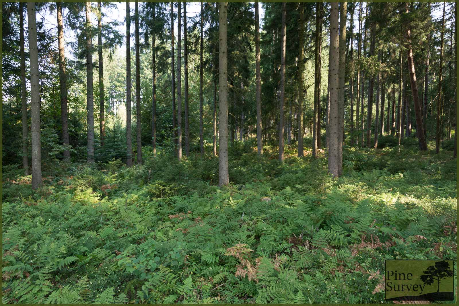
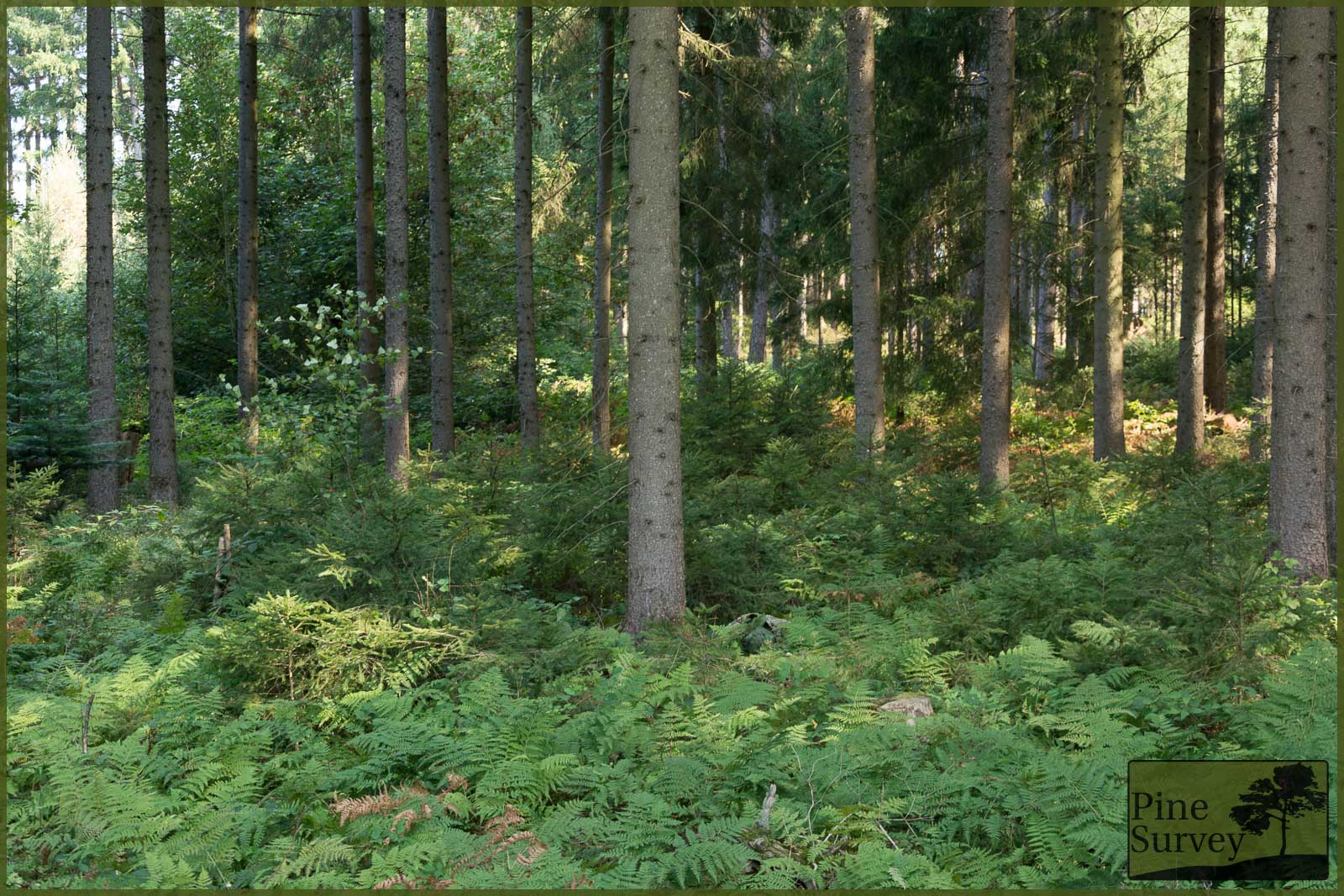
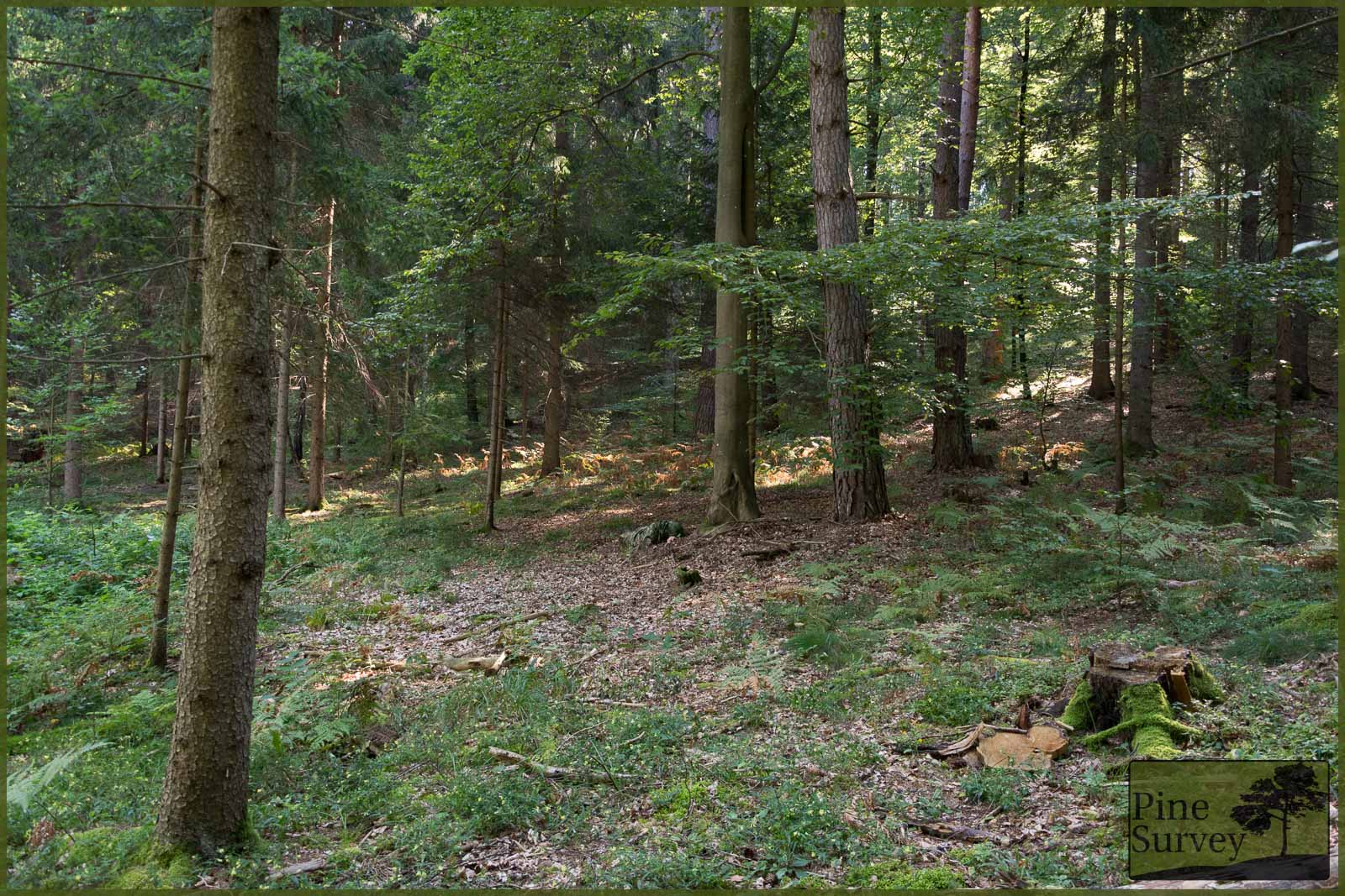
Location 1
This first location is one you already know from my previous reviews. It is a typical European mixed forest with a high foliage canopy and some basic bushes, ferns and little trees on the ground.
Wide angle shot – standing
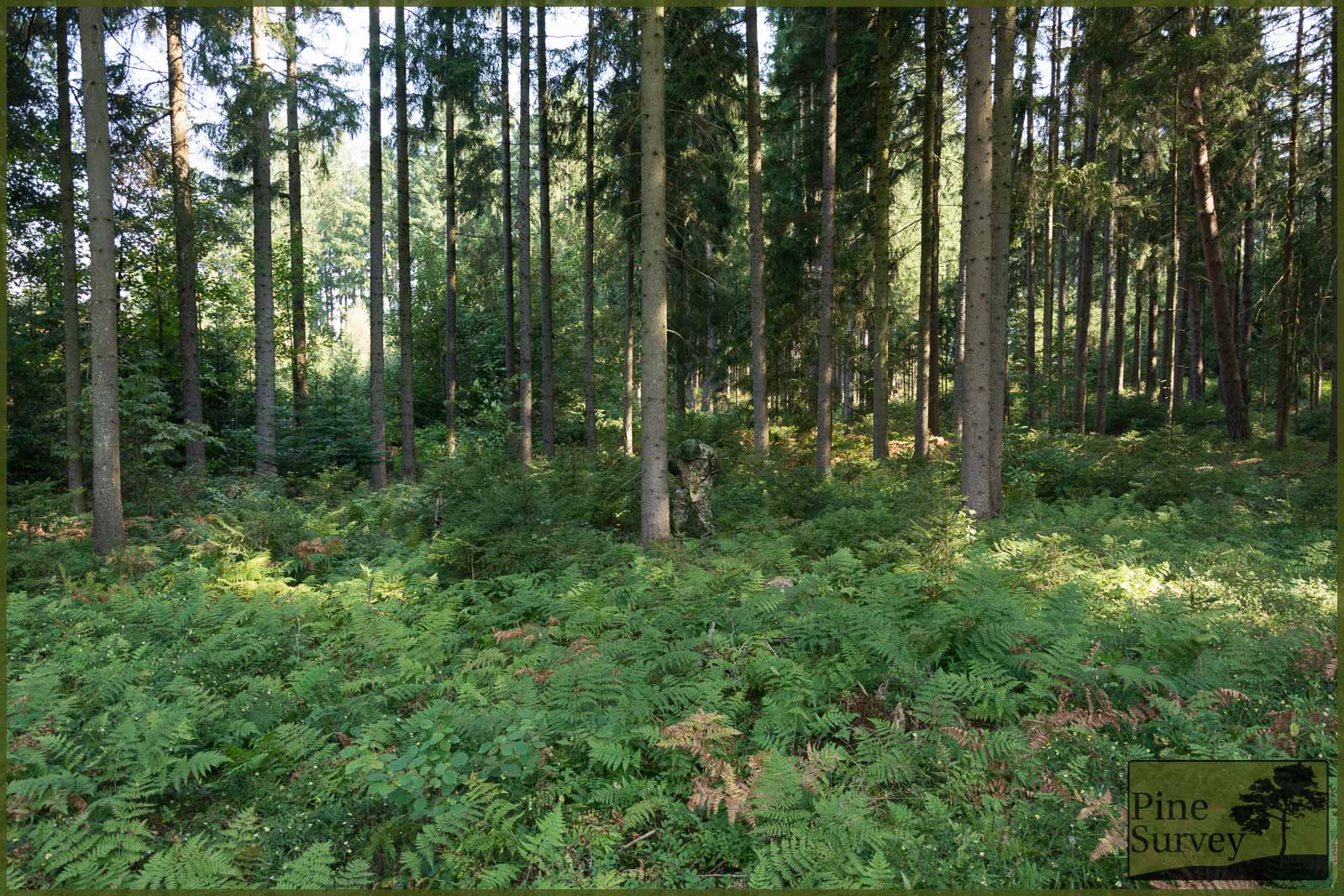
Location 1 – Standing, wide angle lens
Given the color mix of 8 colors with dominantly brown and reddish tones, but with a green background, ConCamo breaks up the silhouette quite good in the standing position. The macro elements are evenly distributed over the fabric and therefore on the uniform, breaking up the human shape effectively. At the same time the colors blend into the surroundings.
35mm, showing the actual distance – standing
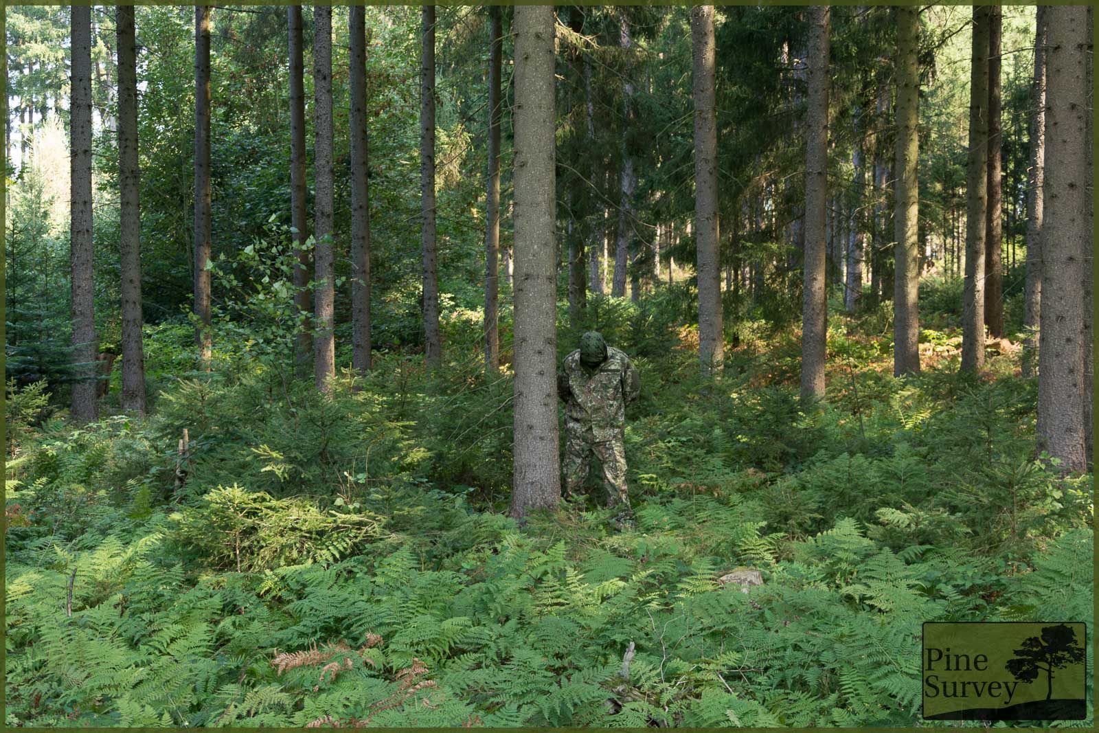
Location 1 – Standing, 35mm
Taking a look at the actual distance of roughly 10m, you can clearly see the brownish macro elements, mimicking the branches, while the green midi elements provide the illusion of foliage. The khaki background actually gives the impression of looking through bushes. In this setting however, more greens would be ideal at this range and environment.
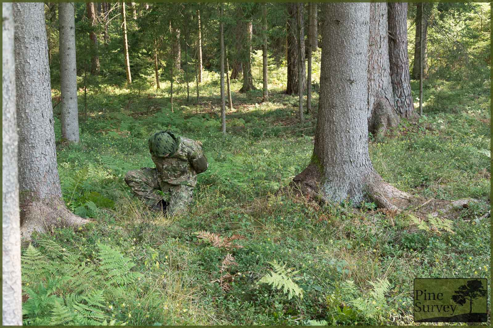
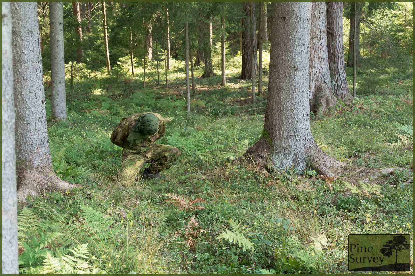
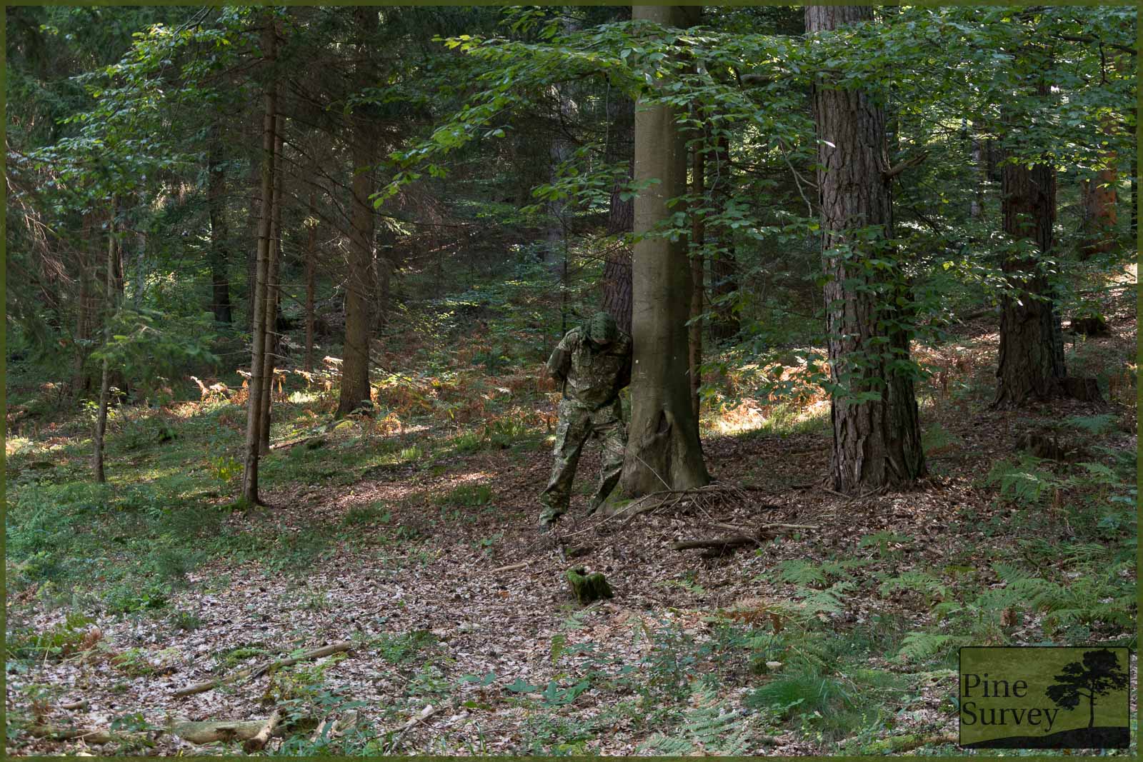
Wide angle shot – kneeling

Location 1 – kneeling, wide angle lens
Minimizing the human shape is always an advantage. In doing so the silhouette gets broken apart even more. The macro elements work quite well, while the midi elements provide further nuances to create a concealing effect.
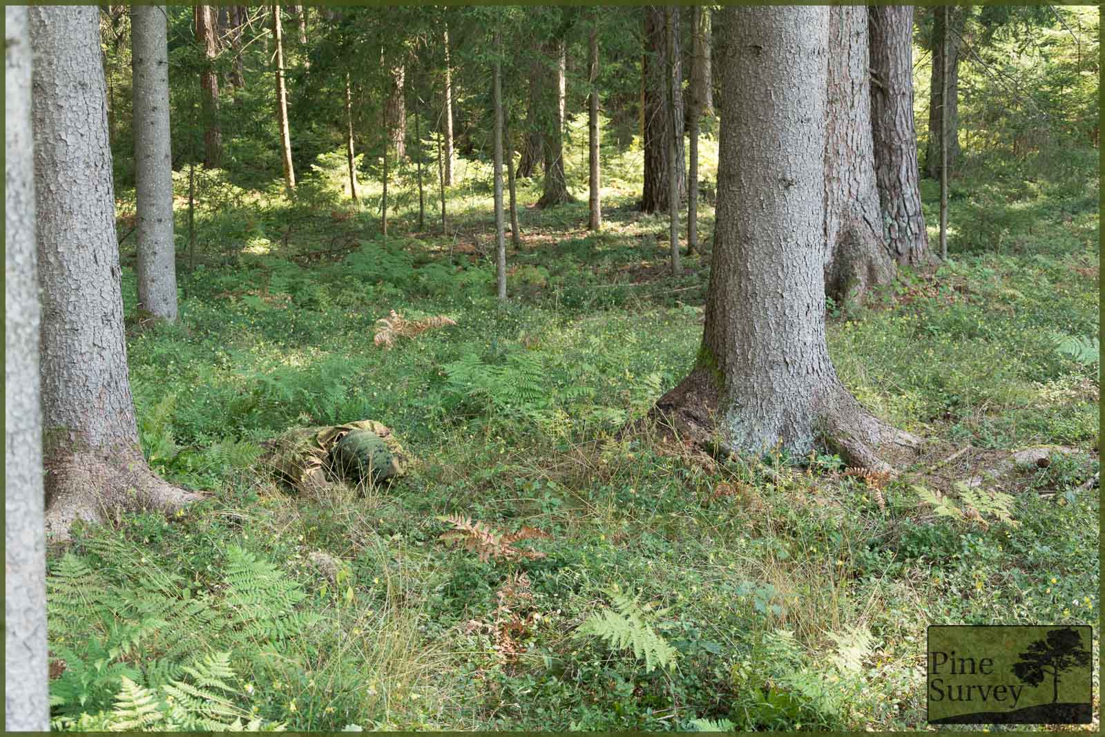
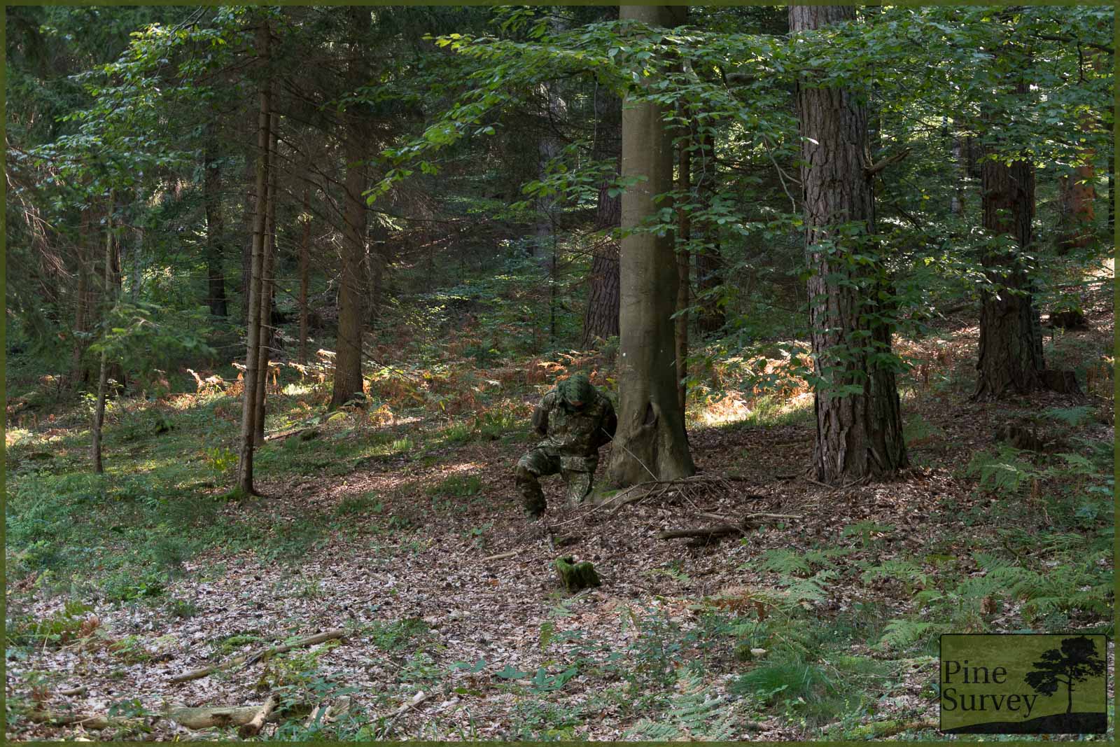
35mm, showing the actual distance – kneeling

Location 1 – kneeling, 35mm
Taking a closer look at this setting, the actual distance of 10m shows how ConCamo is breaking up the silhouette with its pattern. In this picture the tigerstripe effect is more obvious, although it is enhanced by the folds in the shirt and the velcro tab on the chest.
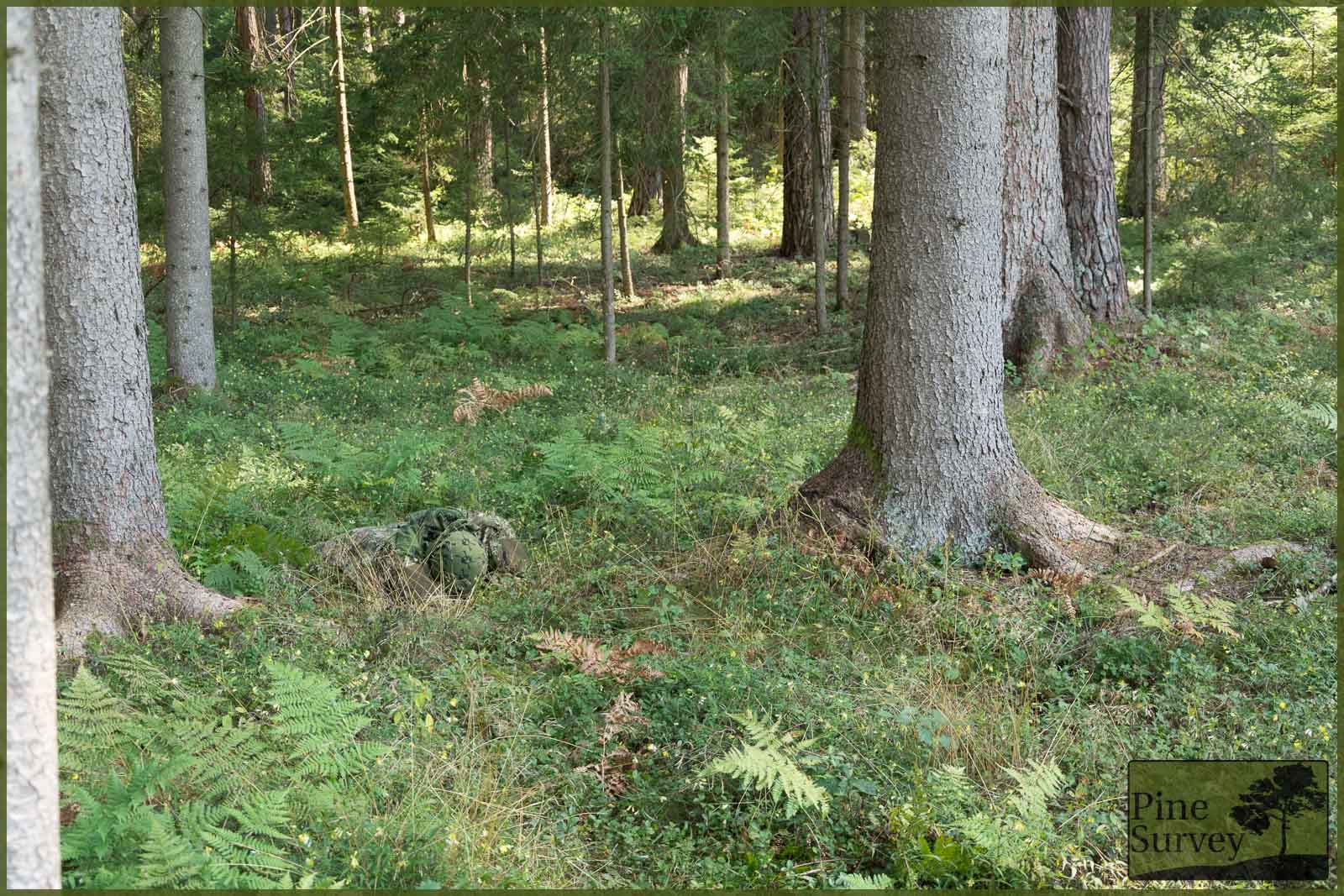
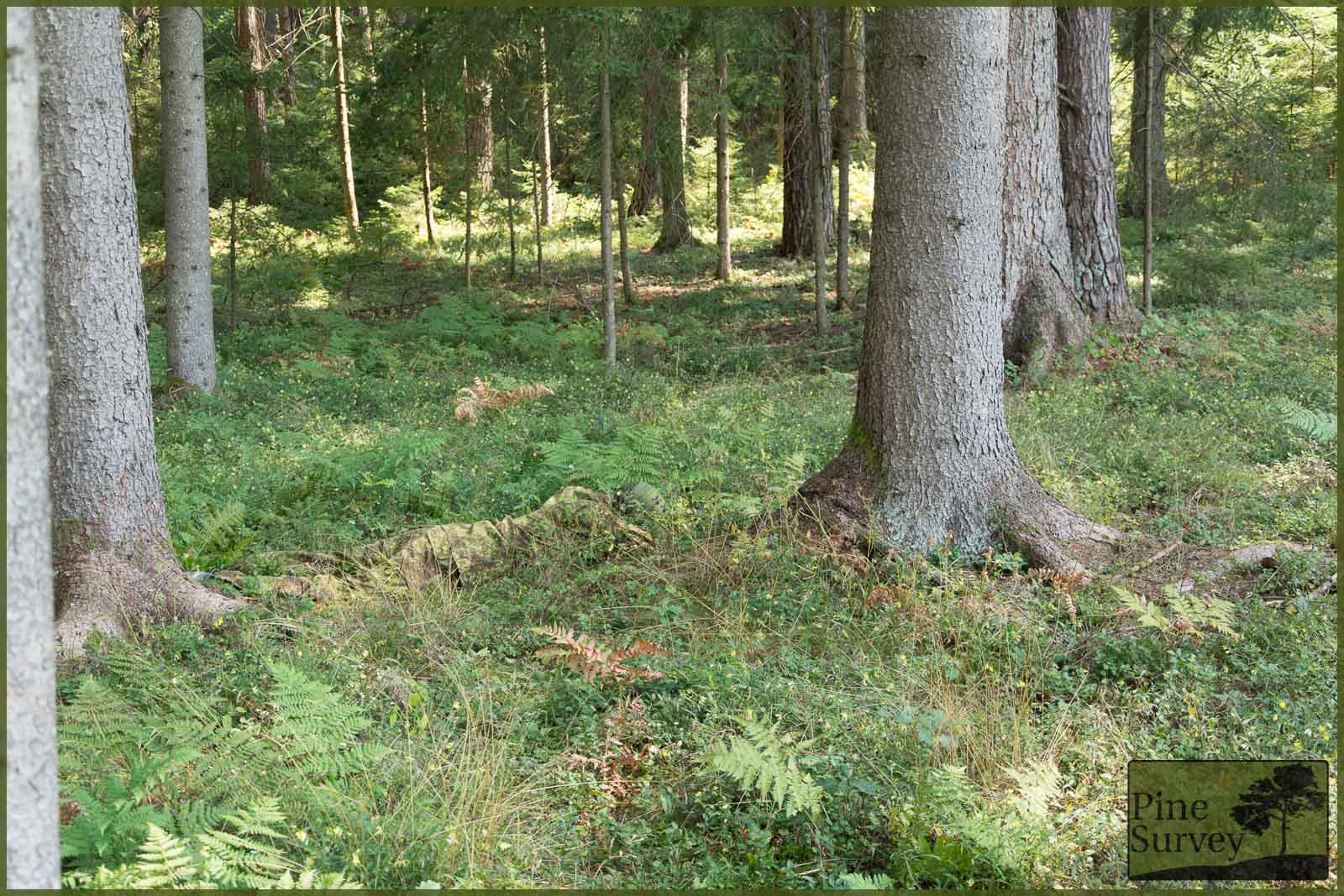
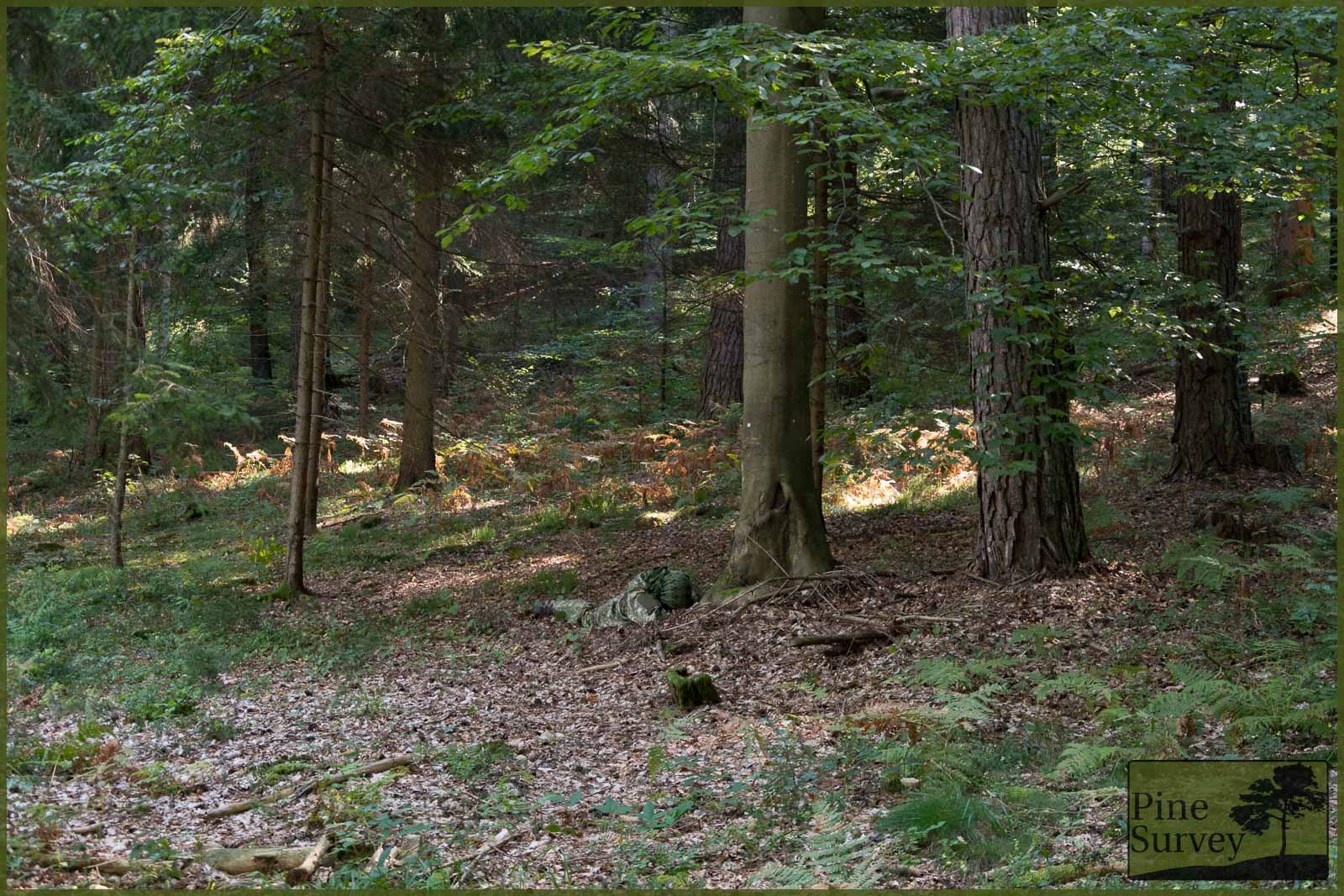
Wide angle shot – prone
Location 1 – lying, wide angle lens
Going into the prone always makes the human body disappear in this location, especially with the current fern undergrowth. I will add the picture however for the sake of completeness.
35mm, showing the actual distance – prone
Location 1 – lying, 35mm
As already mentioned, the prone offers perfect concealment in this situation. With the 35mm zoom you can identify me however, but only, if you look close enough. Colors and pattern mix in quite well.
Location 2
The second location is not far from location 1, but with less vegetation on the ground. I wanted to test the micro elements and how good they complement the camouflage pattern in concealing the human silhouette at close range.
As you know from my previous reviews, this is usually the moment of truth when PenCott Greenzone prevails over competing patterns. (These are the only comparison shots in this review. More will follow in a second review soon. All shots are done with 35mm, showing the actual distance).
ConCamo – Kneeling
Location 2 – kneeling, 35mm
The first picture provides a good impression of the macro and midi elements at work, while at the same time showing some of the micro elements. The colors match the surroundings quite well, and if some additional dead ferns had been around I think the effect of ConCamo would have been even better.
Nevertheless the pattern breaks up the silhouette, even at this close range and the colours do the rest.
ConCamo – Prone (head towards observer)
Location 2 – prone towards observer, 35mm
Lying in the prone towards the direction of the observer, and therefore exposing as little surface as possible, really makes ConCamo work its magic. Close to the ground the colours and elements of the pattern are providing a convincing effect.
ConCamo – Prone (sideways to observer)

Location 2 – prone sideways, 35mm
This doesn’t change when looking at ConCamo in the prone, from the side. The only thing making the silhouette stand out a bit, are the folds in the uniform. Other than that, the pattern blends in very effectively.
From my personal experience with all the patterns I have tested so far, the only pattern to perform like this at this close range is PenCott Greenzone. To give you a short comparison, I will add three pictures at the same location, with the same setting here:
PenCott – Kneeling
Location 2 – kneeling, 35mm (PenCott Greenzone)
PenCott – Prone (head towards observer)
Location 2 – prone towards observer, 35mm (PenCott Greenzone)
PenCott – Prone (sideways to observer)
Location 2 – prone sideways, 35mm (PenCott Greenzone)
Location 3
Looking at ConCamo I wanted to know how it does in a more deciduous type of forest. Location 3 is still mixed forest, but I found myself a nice spot to test ConCamo, right underneath a European beech tree.
Wide angle shot – standing
Location 3 – standing, wide angle
From a longer distance you can see that ConCamo is performing better in a more colorful environment of a deciduous forest. The additional brown and reddish colours of the environment fit the pattern itself. As you can see, ConCamo blends into the setting colourwise and the midi elements disperse the human shape.
35mm, showing the actual distance – standing
Location 3 – standing, 35mm
The same can be said when looking at this setting from the actual distance of roughly 15m. Both macro and midi elements interact effectively to break up the silhouette. If you look closely enough, you can even make out some of the micro elements creating different shades.
Wide angle shot – kneeling

Location 3 – kneeling, wide angle
Going into a kneeling position, the camouflage effect becomes even more apparent. The human shape vanishes and the colors blend right into the setting.
35mm, showing the actual distance – kneeling
Location 3 – kneeling, 35mm
Looking at ConCamo in the kneeling position from a frontal perspective at the actual distance of 15m, you can clearly see, how the colours of the pattern match the surrounding environment. Besides the greens, the various brown tones make the pattern quite effective in this setting. The interaction of the macro, midi and micro elements complement the effect even more.
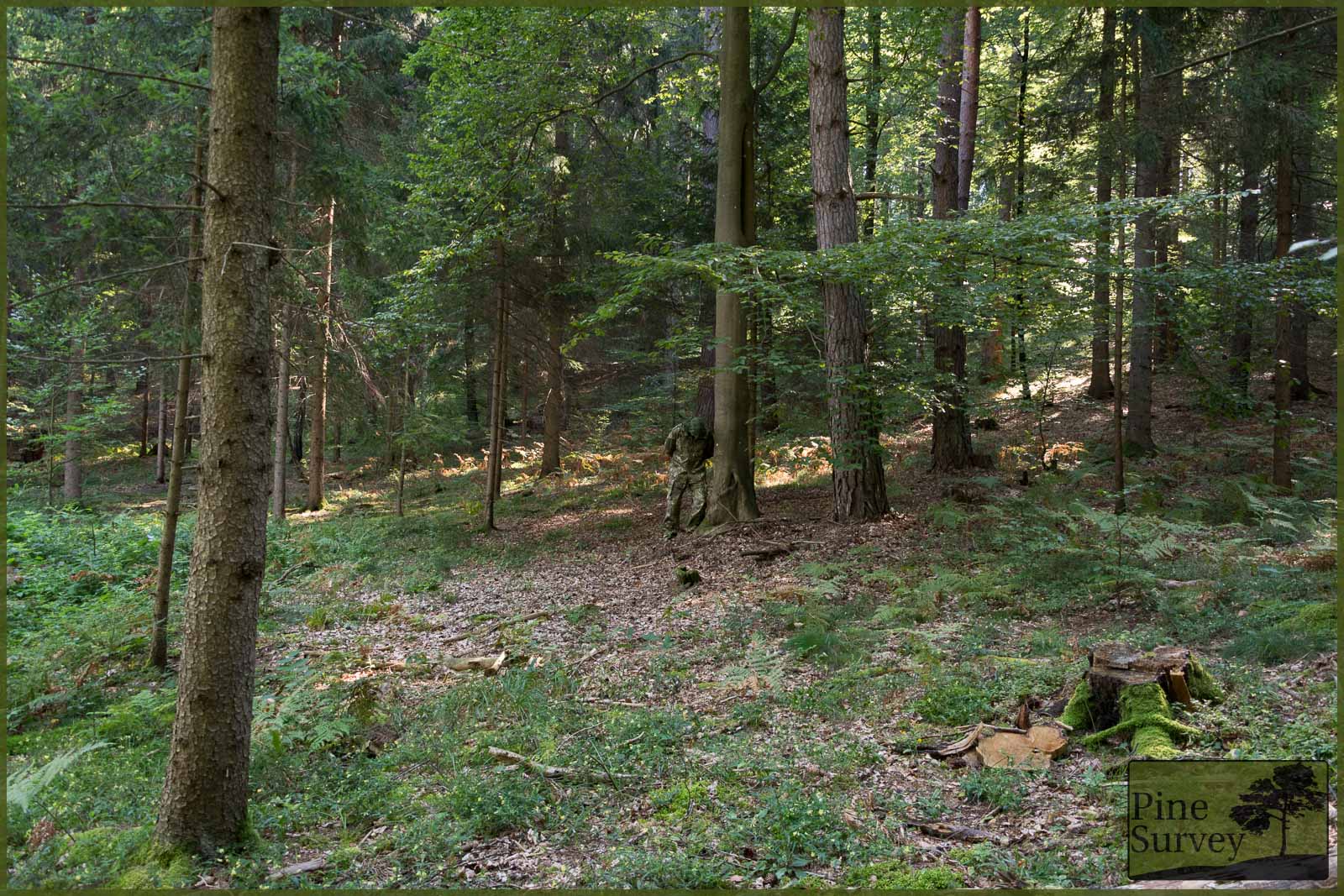
Wide angle shot – prone
Contrary to the other pictures in this field test, there is no undergrowth in location 3. Therefore you have a direct view on the person on the ground, since there is no natural concealment.
Location 3 – prone, wide angle
In this wide angle shot you get a clear picture how the human silhouette is not recognizable at a longer ranger. Colours and pattern elements make the human shape basically melt into the ground.
35mm, showing the actual distance – prone
Location 3 – prone, 35mm
The zoomed in picture gives you a better impression on how the pattern is breaking up the human shape. Although the khaki background in the camouflage pattern results in a brighter colour than the surroundings, it still provides a good concealment.
Conclusion
Coming to a first conclusion, I think it is safe to say that ConCamo is a nice surprise and valuable addition to the camouflage market. The interesting thing is the complete different look of the pattern, which does not necessarily look martial. The choice of colours is spot on and the even distribution of green and khaki in the background, make the pattern very versatile, given the changing perception of colours, depending on the surroundings.
I have to test the pattern in a more arid environment, since I believe it will perform even better there. Nevertheless I was quite surprised by its performance in the lush greens of my standard Camo Testing Area, which you all have come to known by now.
The future will tell, if ConCamo will be able to establish itself in the market. Chances are quite good given the unproblematic availability here in Europe, the „quality mark“ of German Army Specifications and the apparent interest by the authorities.
As far as I am informed, several Gear Makers (Zentauron, MD Textil) will start producing pouches, vests and the like, while at the end of the year other clothing companies will join in. In doing so the most important thing is assured: the end user gets a full set of clothes and gear.
With that being said, I will stop right here. Next will be a comparison with other patterns at my disposal: PenCott Greenzone, Kryptek Mandrake, SloCam and M81 Woodland.
Many thanks to Matthias Bürgin, for providing me with a set of ConCamo, and as always: thank you for reading!
Take care!
No Comment
You can post first response comment.